Custom Homepage
Project
At Alation, I led the design of customizable homepages, giving enterprise customers the ability to tailor their landing experience with content, navigation, and branding that matched their needs. The feature improved engagement by making key resources and workflows more discoverable from the very first click.
Challenge
Before this work, every customer saw the same static homepage, regardless of their role, use case, or company priorities. Large, complex organizations needed a way to surface the most relevant information for their teams—whether that was a data glossary, key reports, or onboarding content—without making users dig through multiple menus.
Duration
6 Months
Team and responsibilities
I acted as the product designer. The team comprised of a lead UX researcher, product manager, and front-end Developers.
Created mock-ups and flows to follow for research’s interview sessions
Took concepts from low-fidelity to high fidelity
Worked closely with the lead engineer to phase out front-end work based on our research findings.
Background
Alation’s data catalog is built for the whole organization—not just data teams. Adoption is key to our customers’ success, so we focused on making the catalog more customizable and personalizable. These improvements help companies tailor the experience to their needs and better showcase Alation’s value across diverse user groups.
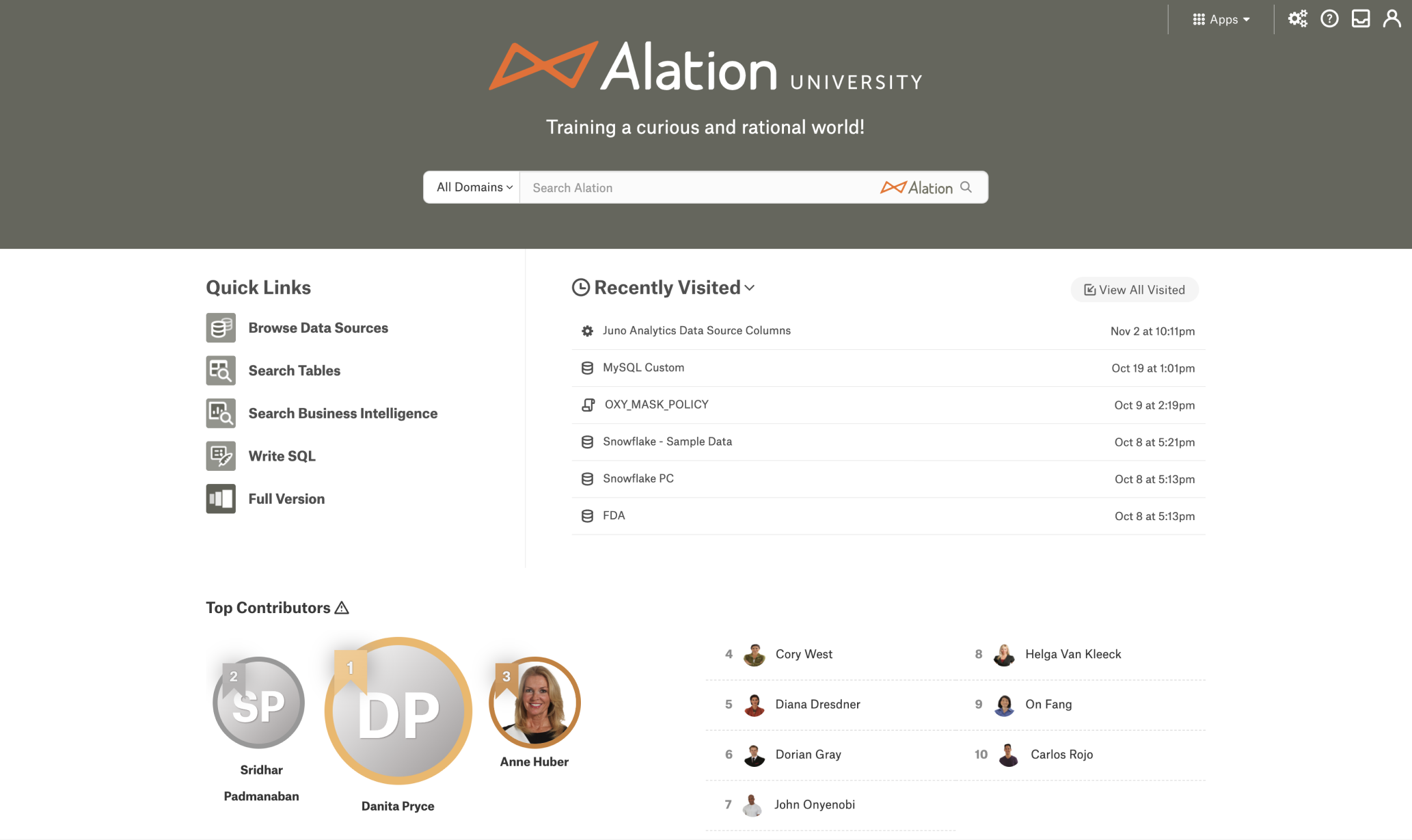
Before / Classic Homepage
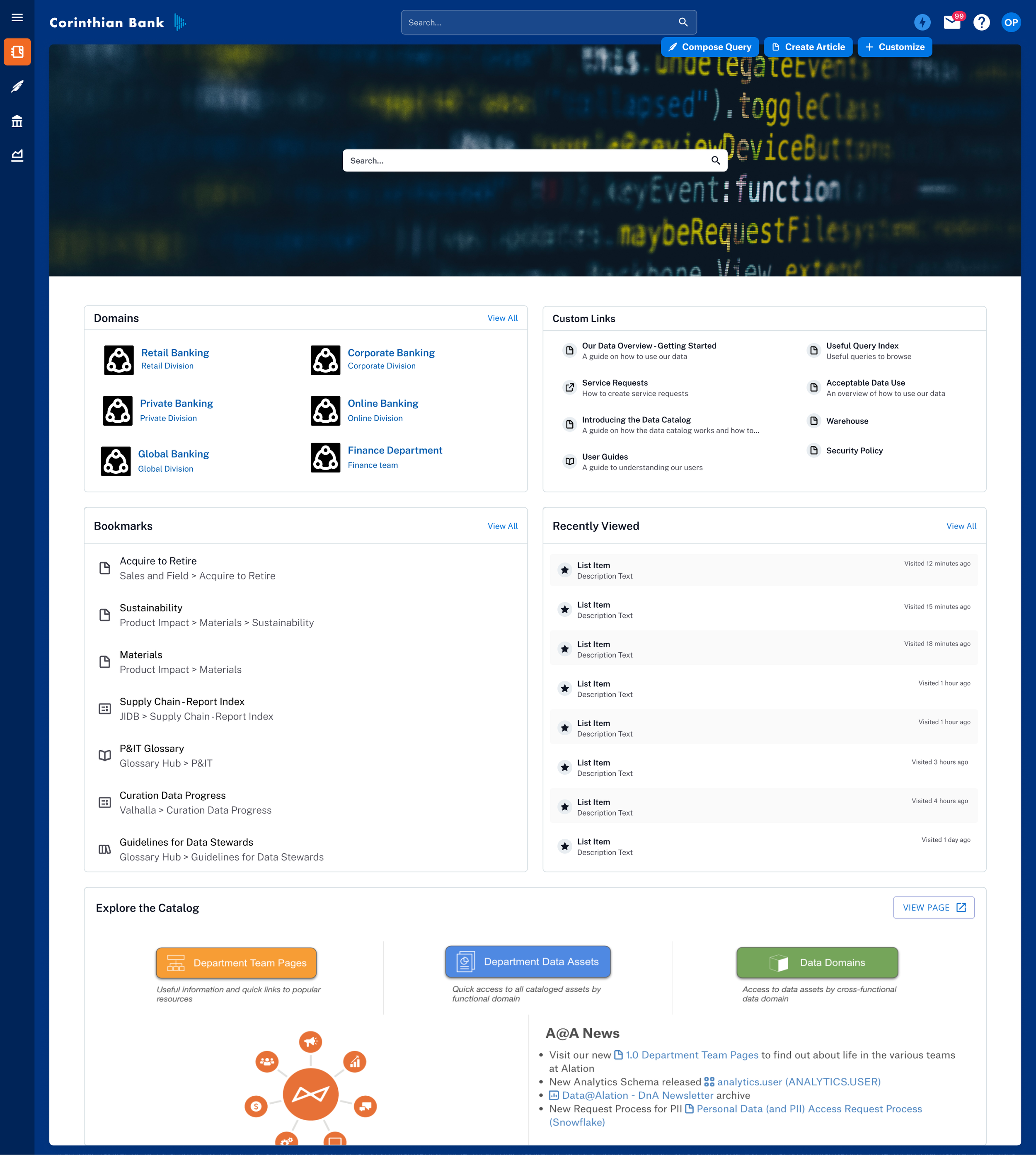
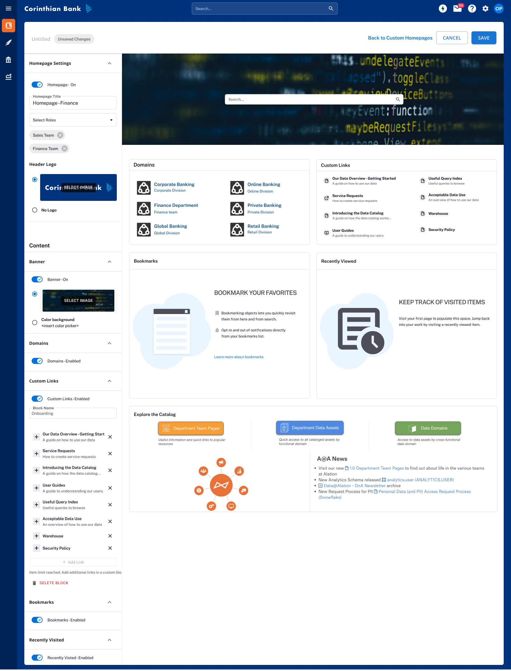
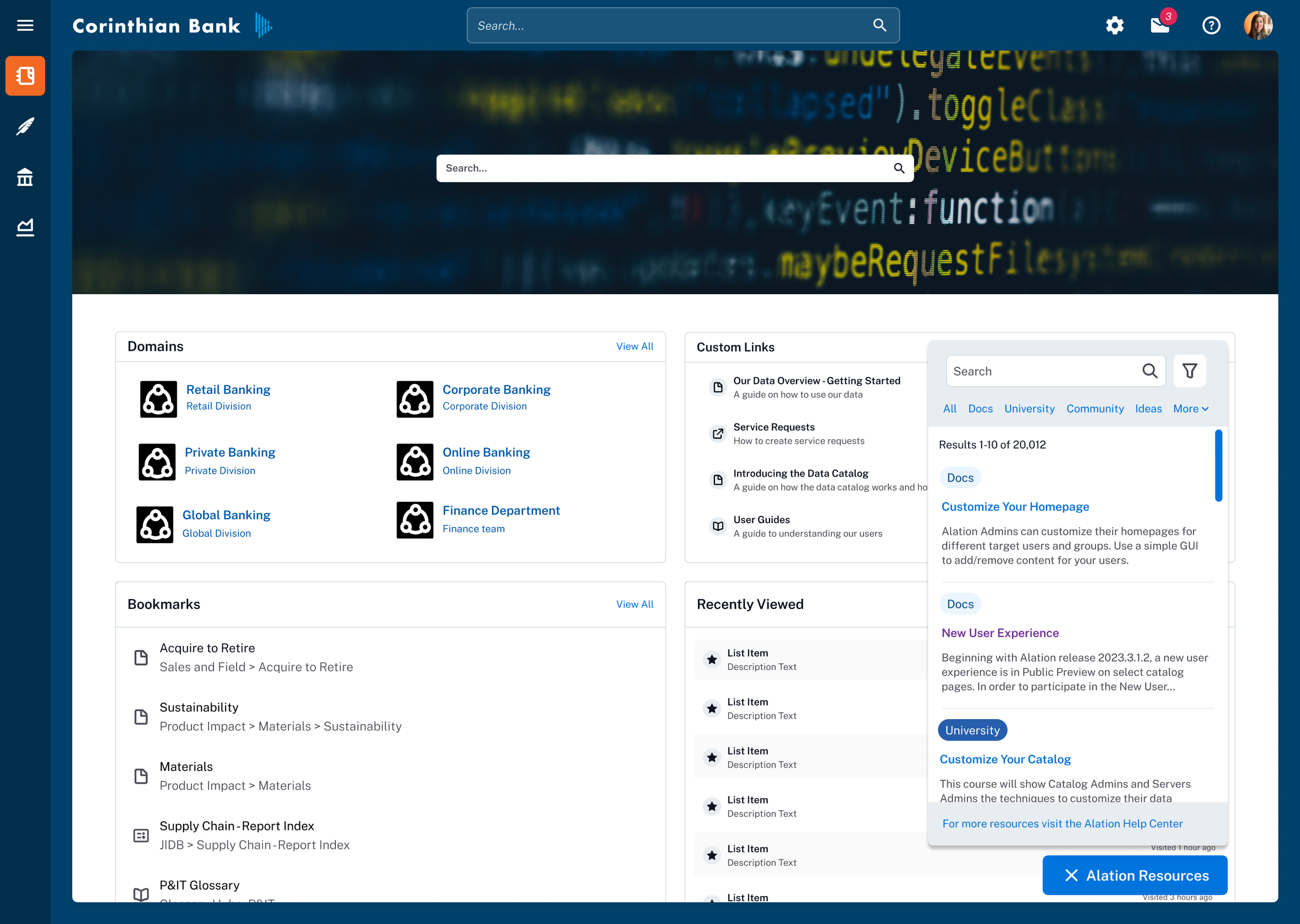
New Homepage after redesign
Process
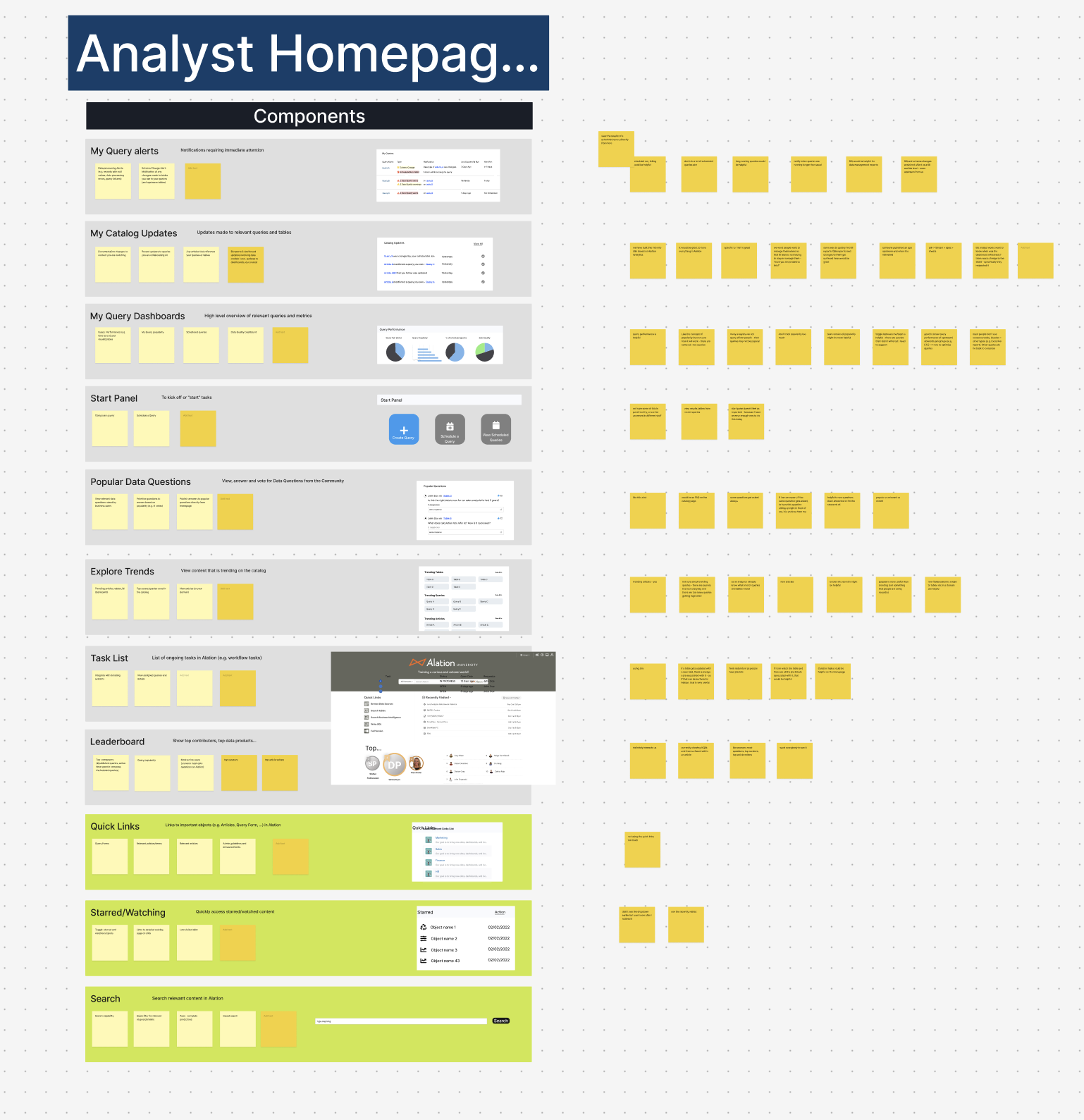
1. Understanding what “home” means to our users
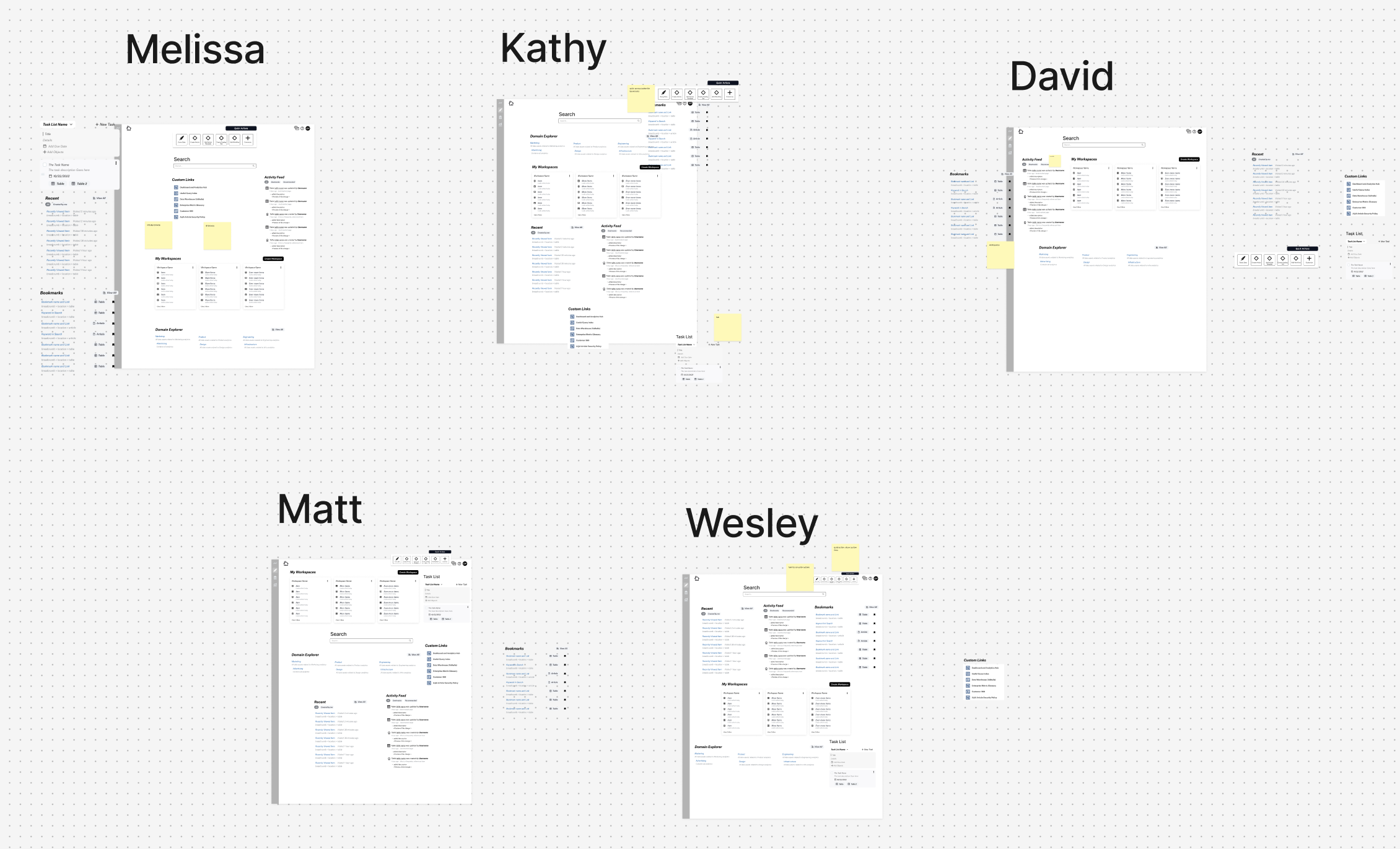
We started with internal brainstorming and assumption mapping, then moved into open-ended user interviews. Our researcher asked customers to prioritize potential homepage elements, from leaderboards to trending content.
The results surprised us — most of our early assumptions were wrong. Users didn’t want Alation-curated content or leaderboards. They wanted company-specific, role-relevant information they could act on right away.
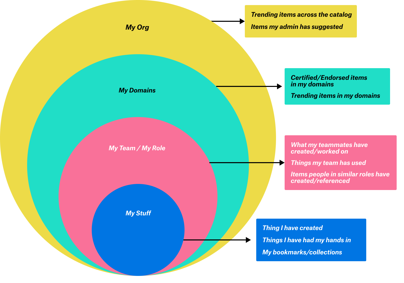
From this, we developed the “rings of relevancy” framework:
My stuff – individual tasks, collections, and bookmarks.
My team’s stuff – domain-specific content and shared work.
Org-wide content – onboarding, trending datasets, announcements.
2. Low-fidelity concepts and co-creation
I created several low-fidelity prototypes and invited customers to “build their own homepage” by prioritizing and arranging modules. This exercise confirmed the rings of relevancy and revealed three core themes:
My Library – A personalized collection of objects, alerts, and notes for jumping back into work.
Task Starter – Quick-start buttons for common actions, improving task completion speed and feature adoption.
Discover – Exposure to relevant, high-value content to extend session length and keep users exploring.
3. High-fidelity design and feature frameworks
After validating the core themes, I moved to high-fidelity designs to share with leadership and engineering. These designs were built to integrate seamlessly into the larger platform redesign while being flexible for future customization.
Key modules included:
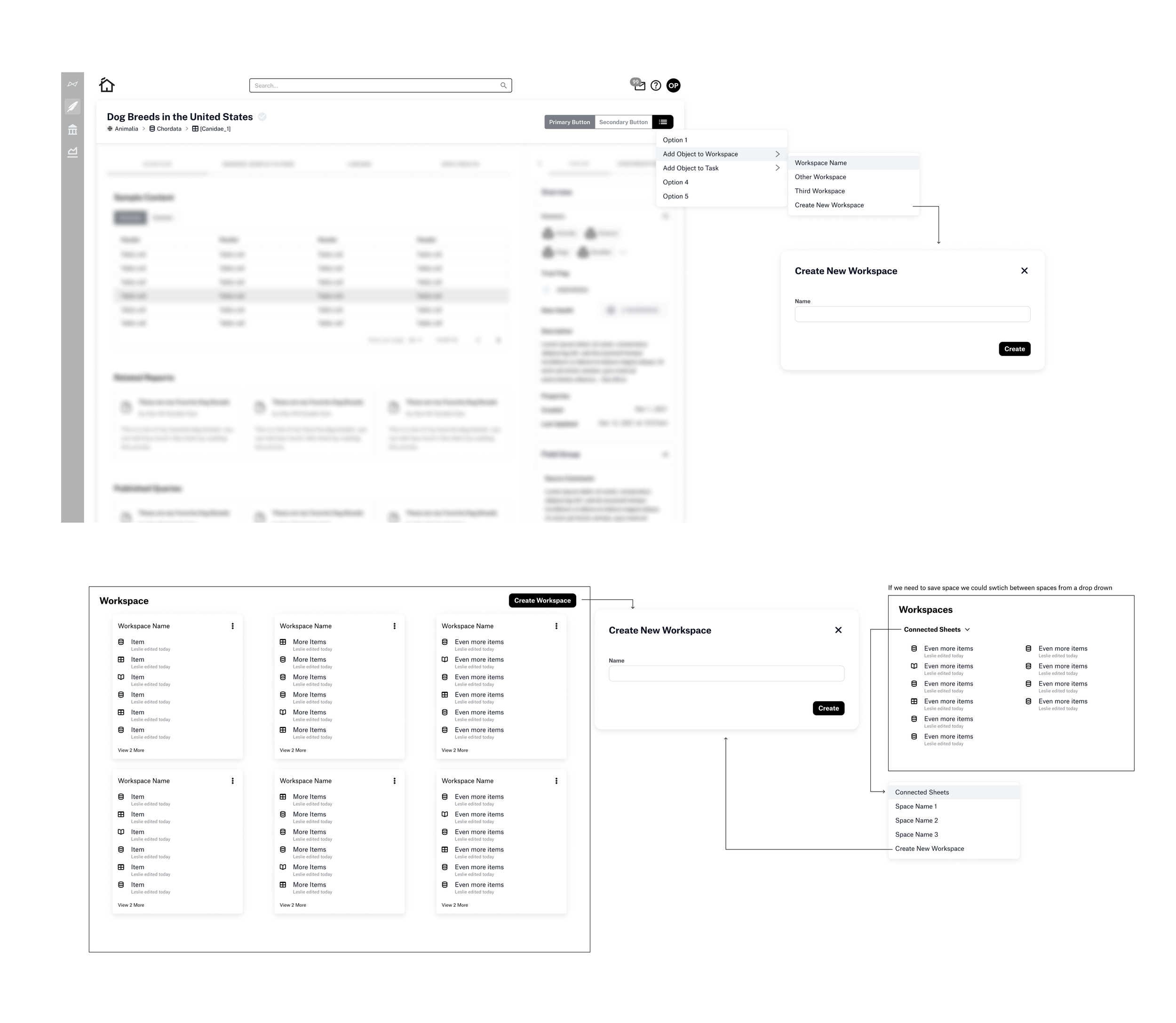
Collections / Workspaces
xOrganize datasets for research, analysis, and curation projects.
Share with stakeholders or publish for discovery.
Add notes, set limits to avoid overload, and manage objects with ease.
“I’m currently moving off of some projects and onto another project right now, so if I had a saved list of important objects in this particular project, it would be super handy if I can get a link and share that with my colleagues to say these are the articles I found useful.” - Matt, Diageo
“This really resonates with me. At any given time, I'm working on three to four projects with separate use cases, separate data sets, and separate stakeholders. And I have to stay organized. So I could have a workspace for my project and then any of the data sets in Alation that I use for that project I put there so that I can quickly find them.” - David, Nestle
Workspaces evolved to the concept of “collections’
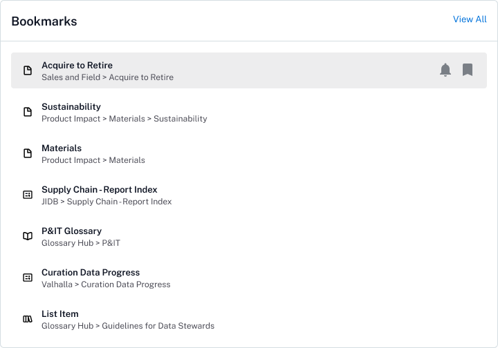
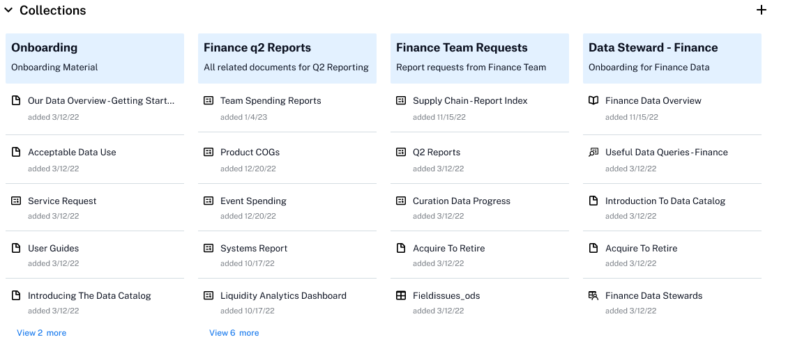
Bookmarks (revamped)
Quick access to frequently used objects.
Optional notifications for material changes.
Visible in a dedicated panel (no longer buried in a dropdown).
Breadcrumbs for context.
Disambiguated the previous ‘star’ and ‘watch’ features by combining them into one, intuitive bookmark feature.
Added global navigational entry for bookmarks for easier access to bookmarked items across the catalog.
Recent
Jump back into transient or in-progress work.
Expanded from 6 to 10 items with date and frequency indicators.
Breadcrumbs to locate the source.
Task List
Designed to help users keep track of their work as they research, curate, and analyze data in Alation. The task list supports collaboration across teams and transitions by making it easy to create, assign, and manage tasks right within the platform. It complements existing project management software by providing an in-context tool that keeps workflows visible and helps users stay oriented between sessions. This centralized space ensures requests and priorities stay top of mind without disrupting momentum.
Building the Homepage
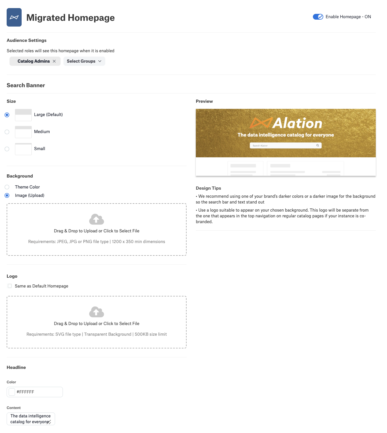
The homepage redesign was a multi-layered effort that included not just the final landing experience, but also the tools users need to customize it. I designed a homepage builder that works like a simplified Squarespace — letting users build and preview their page simultaneously, giving immediate feedback and control.
Throughout the process, I prioritized empty states as moments to educate and inspire users, turning what could be a dead-end into an opportunity for discovery and action.
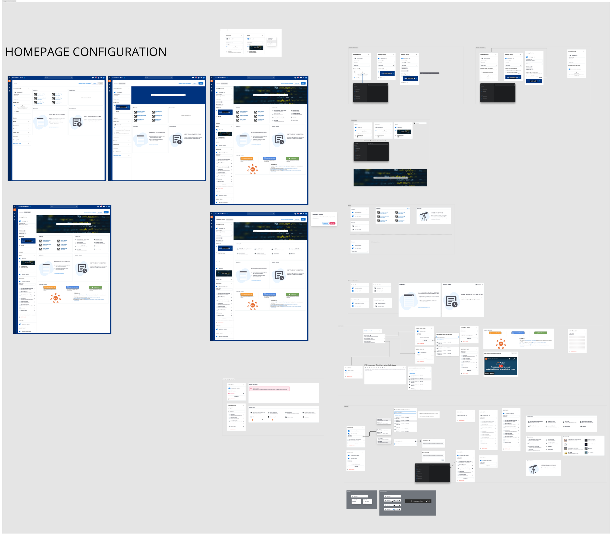
Previous homepage builder: no preview, limited customization
Homepage builder: live preview of homepage with content
Mapping all the potential states
I partnered with engineering to make sure there were designs for all of the states we could test for.
Answering questions such as:
What happens if there is a link to a deleted item in the catalog?
What does the site look like if there are no bookmarks or recently viewed items?
Migration Strategy
To ensure a smooth transition to the new homepage experience, we prioritized an intuitive migration path that minimized friction for existing users. Our approach began by carefully mapping legacy homepage components to their counterparts in the new design, focusing first on one-to-one feature parity.
By rolling out familiar elements before introducing net-new features like collections and quick actions, we allowed users to adopt the updated interface gradually and confidently. This phased migration strategy helped reduce disruption, build trust, and set the stage for broader customization options in future releases.

Easy mapping for custom links. In the new experience users are able to create more than one custom link block and the existing links from the old homepage were easily ported over to the new experience.
Outcome
The initial phase of the Custom Homepages redesign—focused on personalized content surfaces like bookmarks and recent activity—was successfully released and well-received by users. Though the full vision, including collections and quick action modules, remains in development, early adoption of the bookmark feature demonstrated meaningful engagement gains.
Bookmark usage among NEO users grew from 11.7% to 17.3%, with average saved objects increasing from 3.2 to 3.9 per month. Improved discoverability of bookmarks also encouraged new users to start saving objects, driving deeper catalog interaction. Bookmark users visited the homepage 29.2 times per month, significantly higher than the 24.2 visits seen in the classic homepage view.
These early wins validate the approach and provide a strong foundation for continuing to roll out the remaining phases of customization.
Summary
The Custom Homepages redesign marks an important step toward a more personalized, user-centered Alation experience. By focusing on early wins like bookmarks and recent activity, we delivered measurable engagement improvements while laying the groundwork for richer customization features.
Ongoing development of collections, quick actions, and other modules will continue to empower users to tailor their workflows, drive adoption, and deepen value across diverse teams and use cases. This project underscores the power of iterative design, close collaboration, and listening closely to user needs to shape meaningful product experiences.