Client Health
Project
I was tasked with designing a feature for IT administrators and support engineers that would enable them to diagnose and troubleshoot issues with client connections.
Challenge
Learning the domain and technical process behind network connection issues.
Showing complex data in a simple and meaningful way.
Team
Product
Duration
1 year
Team and responsibilities
I acted as the product designer. The team comprised of a product manager, dev lead, and a few engineers (frontend and backend).
My Key Responsibilities were to:
Work with internal experts to gather domain knowledge
Identify pain points and opportunities in current user process/experience
Design and iterate on client widget component
Document MVP and future iterations
Build working relationship with product and engineering team
Create and maintain visual elements
Project kick-off
The client health project was one of many ‘network health’ projects. The goal of the larger initiative was to improve device and networking monitoring so that our end-users and support engineers could spend less time trying to diagnose the issue and more time with their other priorities.
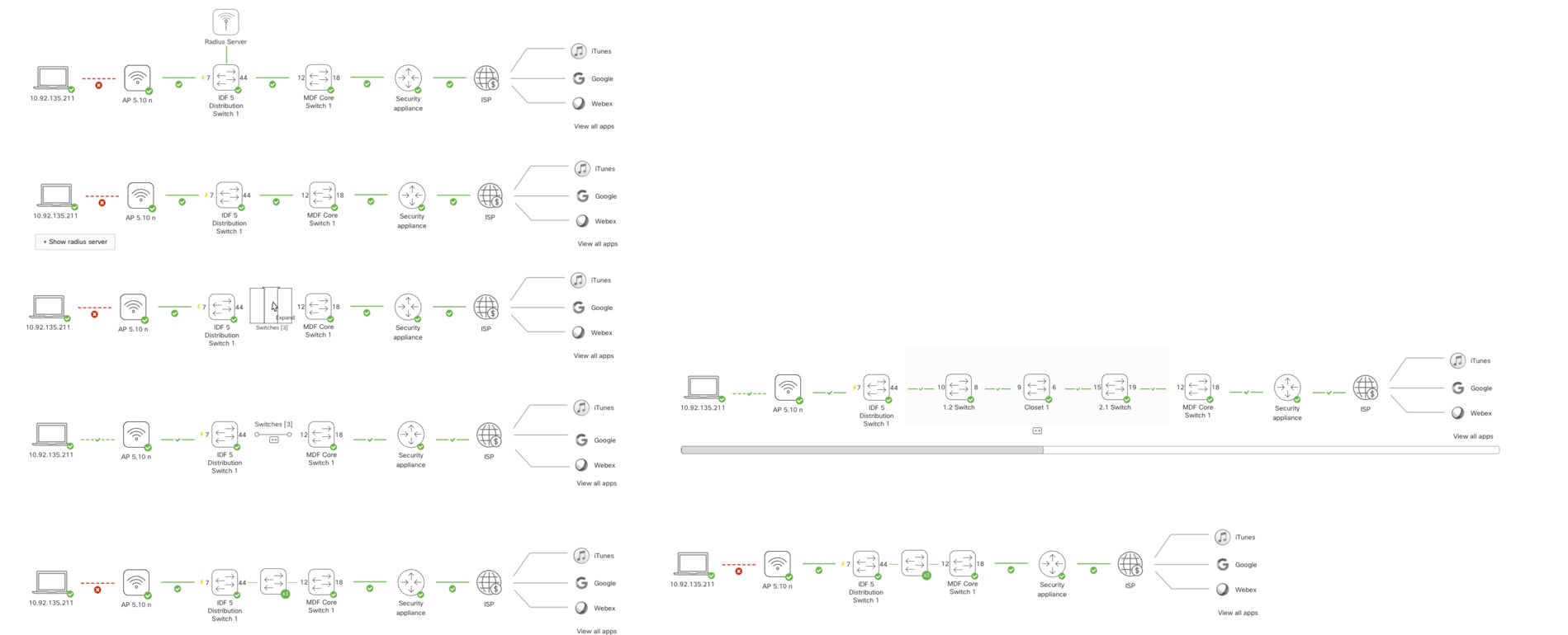
One of the first projects to start the initiative was the wireless health project. This page was added as a monitoring page for wireless connections at a high level.
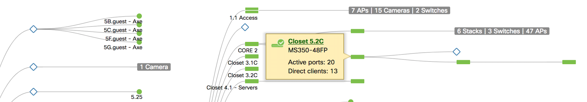
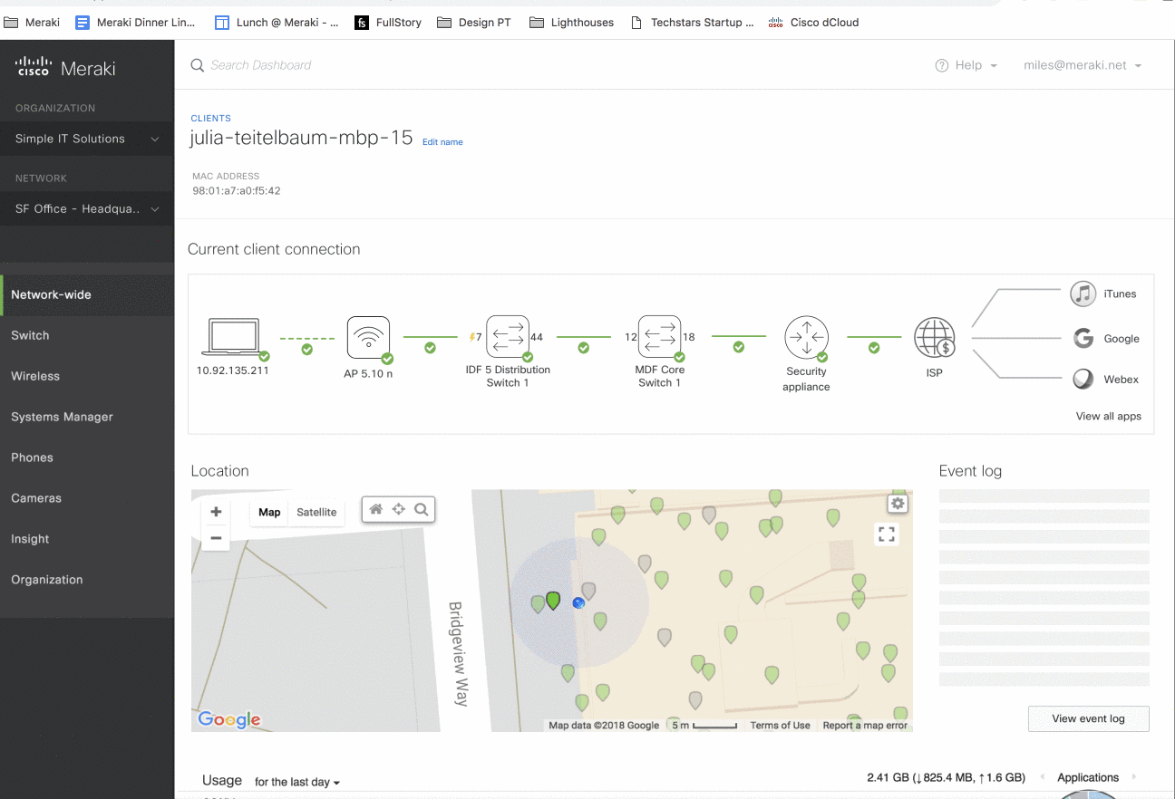
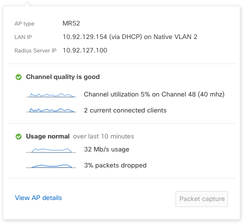
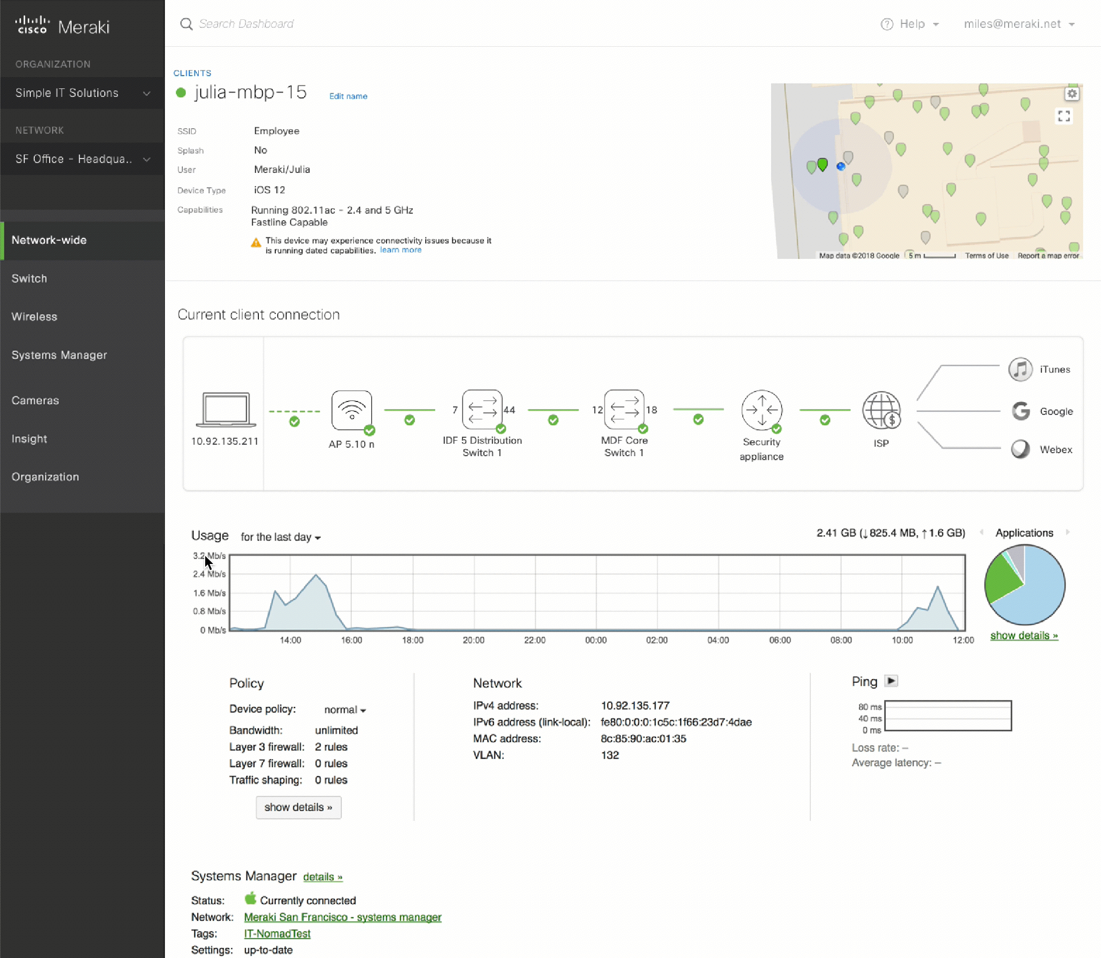
Wireless page displays wireless information for all APs in a network. A user can navigate to a client page for more information if they have to diagnose a specific client problem.
Once a user gets to the client page there is not much information that gives insight into how the client is connected within the network. A user can only determine if the device is online or not.
After hearing feedback from users the wireless and design teams decided that we needed a more granular view of network connections.
“[Wireless Health] ... it’ll send you out to the client page, which doesn’t tell me anything, and if I try to go to event log, see that error, it’s not easy to correlate”
“Boils down to being client focused, end user focused. Looking at things from bottom up instead of top down”“Users just call in saying ‘I can’t connect. Internet is down’ and I don’t know where to start”
The flow for an IT administer is
1. Hear from their end users that there is an issue with the wifi
2. Check the client page (on the right) to see if the client in question is up
3. Go to the wireless page (on the left) to see if any of the wireless providers was having an issue
4. Go to the security appliance to see uplink status
5. Go to the switch page to see port status
6. Go to client and run a few diagnostic tools
There’s no one place for a user to quickly determine “can my client connect? If not, why?”
Understanding the Domain Space
My first step on the project was to learn more about the networking domain space. I knew I had to learn about networking in order to design a simple, meaningful solution to this problem.
Meet with experts
I met with internal stakeholders on our support team, product management teams, as well as development. I asked them to describe to me “tell me about the product you work on and how you know if it’s healthy or not” and “what are the most common issues”? This was to help me understand the troubleshooting process as well as the function of each product in the network.
Documenting health indicators
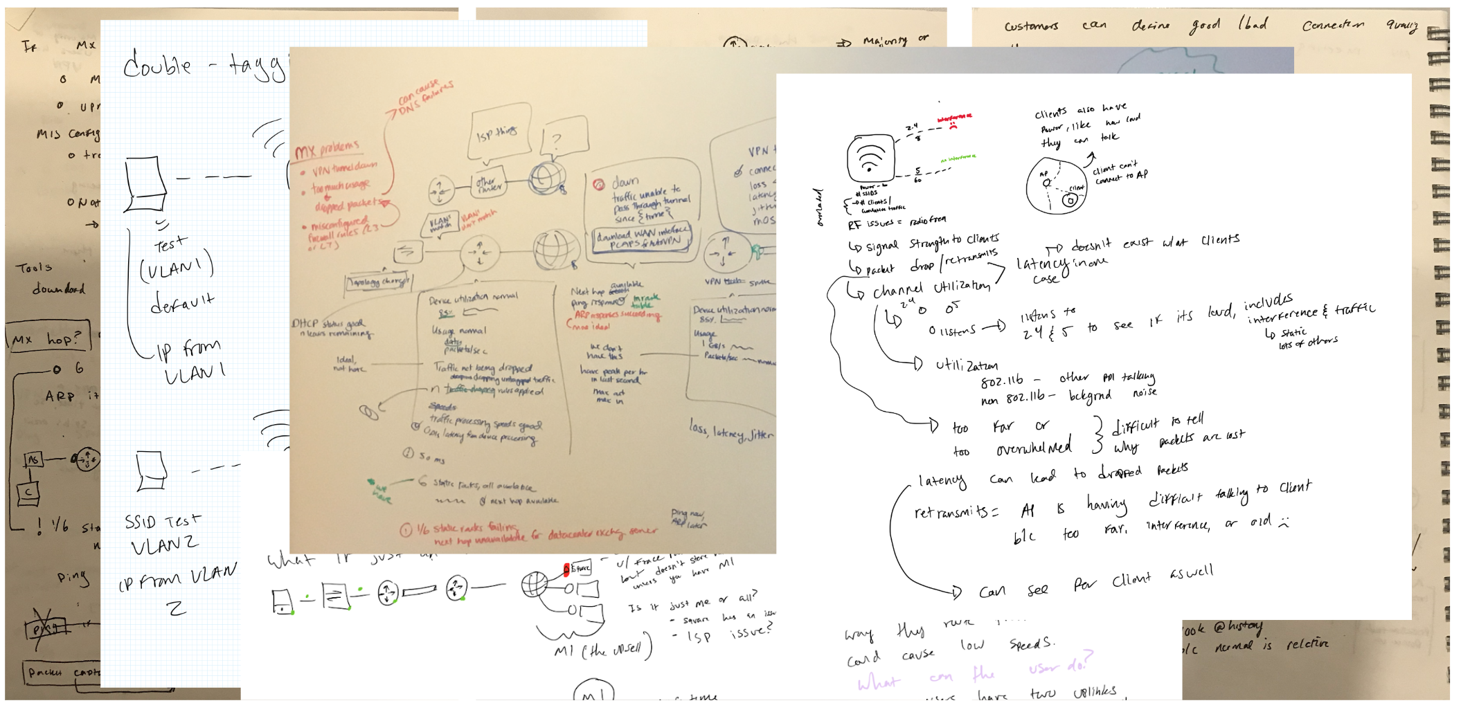
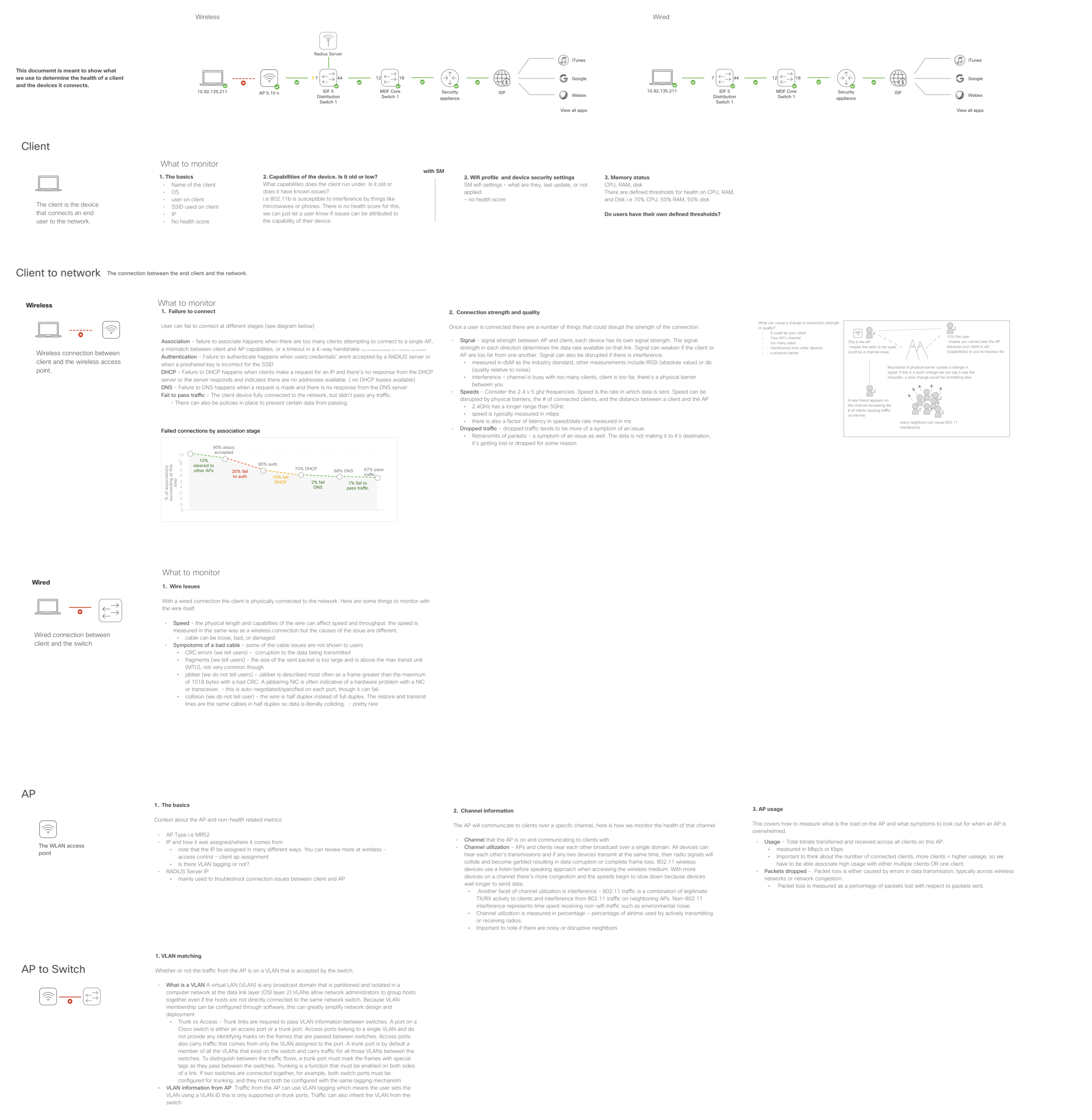
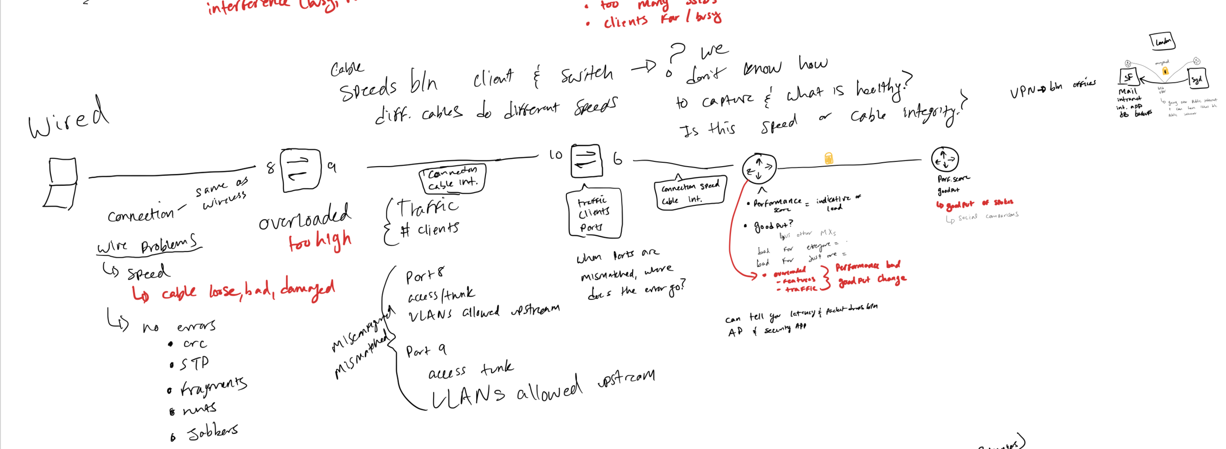
After hours of knowledge transfers, discussions, and white-boarding I knew that I had to document the research findings. For each product and connection I documented health indicators and ways of measuring status. This document also helped me cement the networking information.
Explain like I’m five
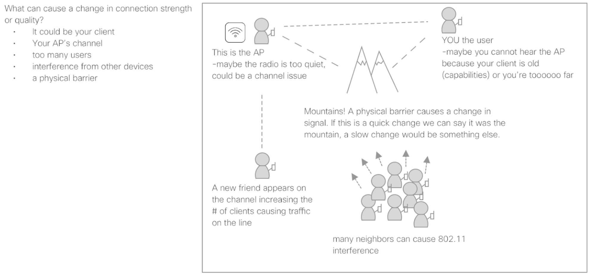
A fun way of making sure I understood the complexities around networking was by explaining the topics in a more approachable way. I use the ‘explain like I’m five’ method to make sure I truly understand complex topics.
Talking to users
I initially began understanding the domain by talking to internal stakeholders. My next step was to understand how our users diagnose and troubleshoot client related problems.
I asked users (6 customers) to walk through recent examples of troubleshooting issues and documented their process.
Design Process
Design Inspiration
After the initial round of exploratory research I then went to sketch out ideas. Below are the key pieces that inspired the initial concept.
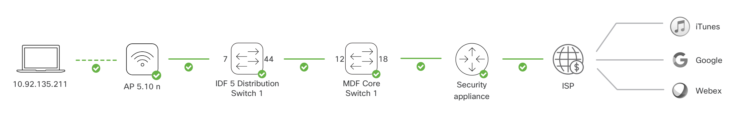
Network Topology: the model we use in the dashboard to show users their full network topology. This visual helps users understand how their devices are connected to one another.
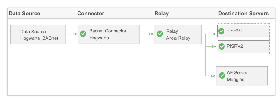
Data flow: the model I created and validated at OSIsoft to represent data flow between applications.
User drawings: looking at how users describe and outline their own systems.
My goal was to use familiar concepts and well-vetted models.
Sketching out ideas
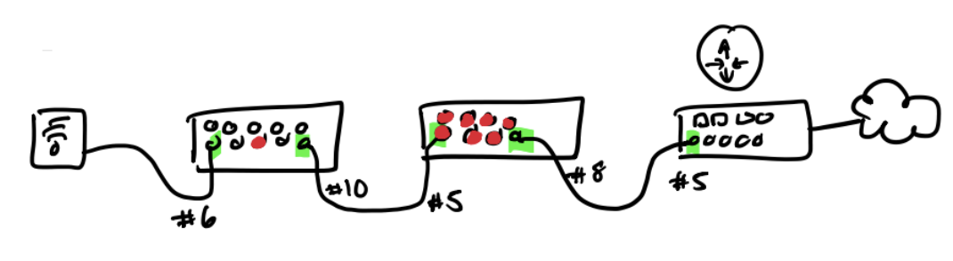
Drawing out topography of clients and device ‘check-points’ to the internet
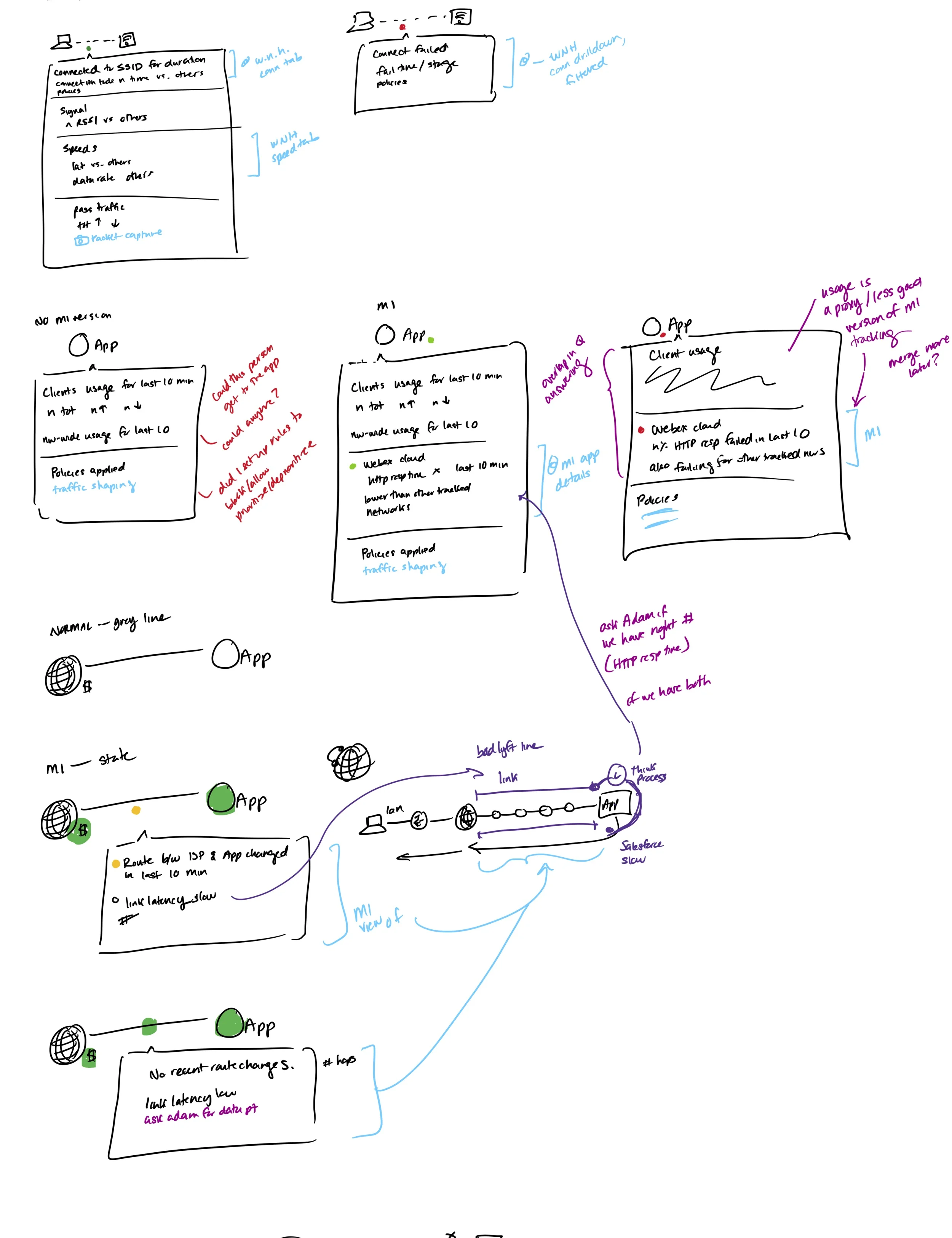
Idea of presenting contextual information when interacting with the different touch-points.
First concept
User Testing in Invision
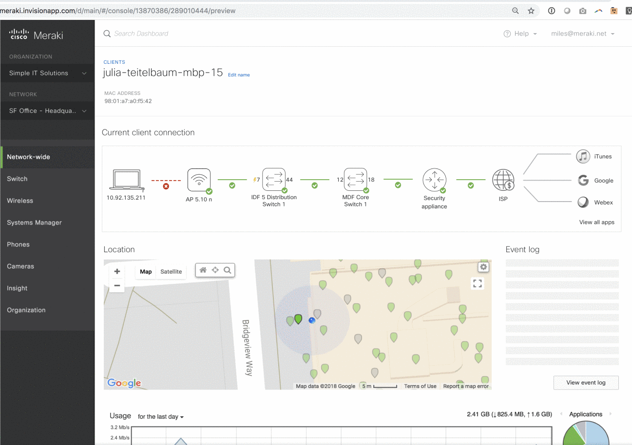
“So, I can come here and see exactly what’s happening? That’s awesome” - customer
“This lowers the amount of time I have to spend with customers trying to figure out the issue” - support
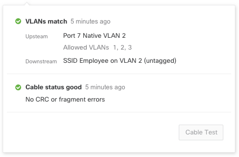
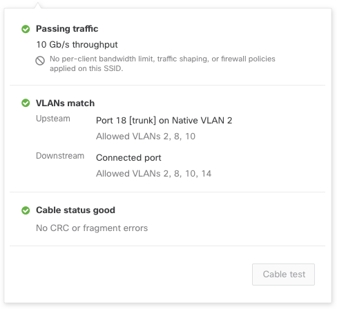
“We get a lot of vlan mismatch issues. This will definitely help identify those.” - support
“I’m really excited about this!” - customer
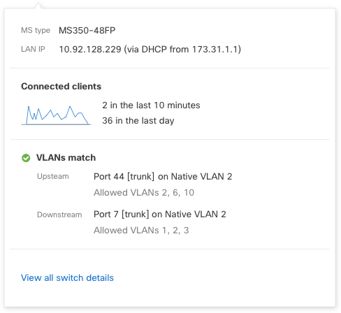
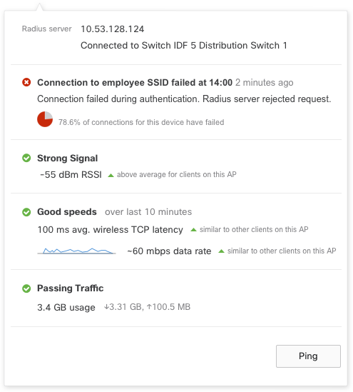
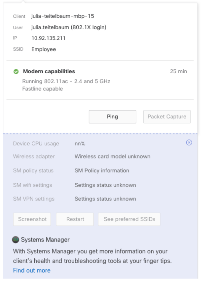
Design Refinements: Popovers
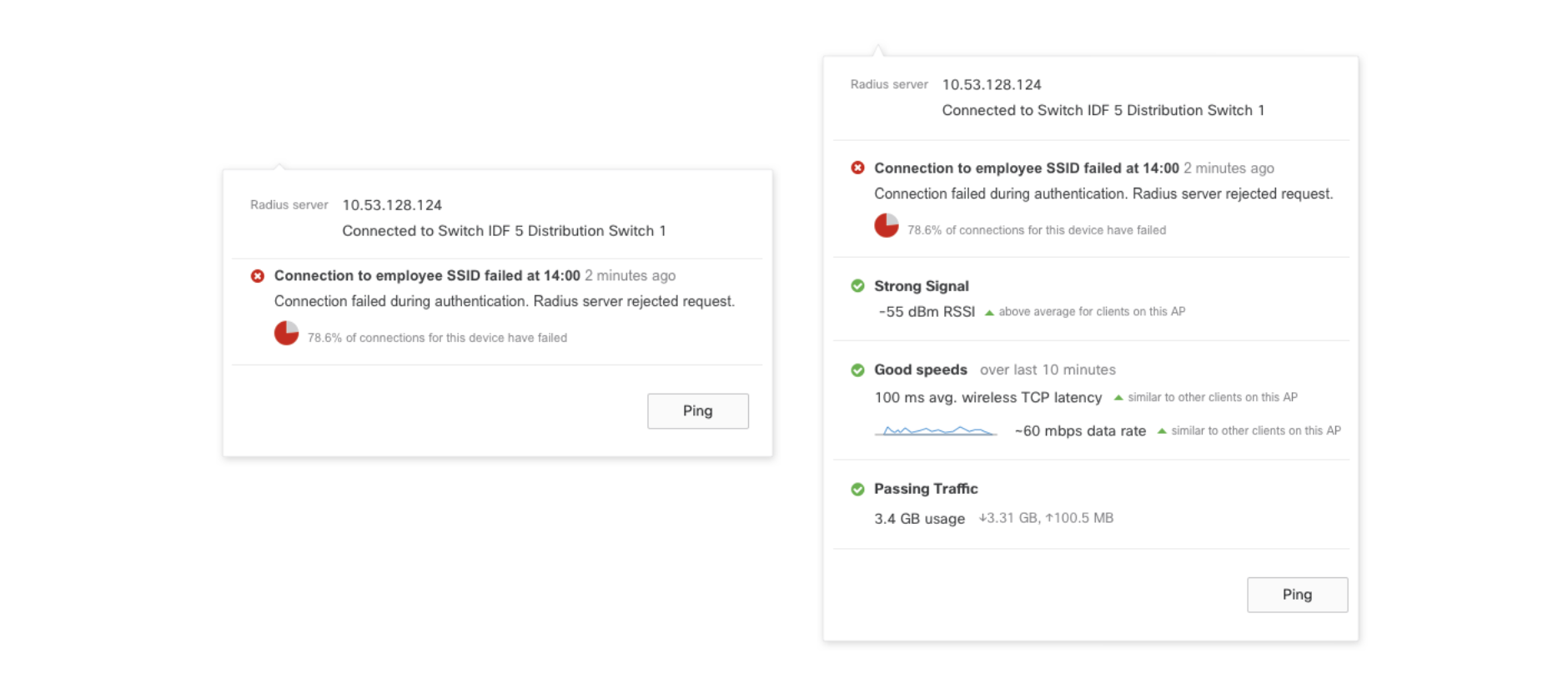
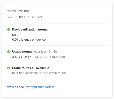
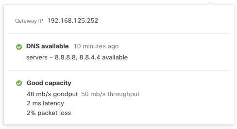
Kept other health indicators in the popover, even when there’s an error.
Even if there’s an issue, I still want to see what’s happening on the device. These are data points that help me understand the full state of things.
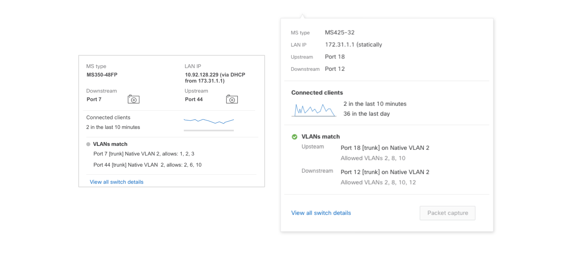
Cleaned up layout and removed unclear icons; made the call to action much clearer.
Popovers

Variations of topology to consider scale
In app marketing
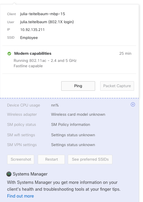
One of our goals was to encourage our users to consider a full-stack solution. The client health component has more value when a user has a full-stack solution and utilizes our add-ons.
One of our applications allows users to manage their mobile devices, giving them insight into things like “application enrollment”, “geo-fencing alerts”, and “clearer client diagnostics”.
Up-sell products within the component to show users the potential of a full-stack Meraki solution.
MVP Design
After refining the data and basic format my next task was to clean up the visual.
Considerations
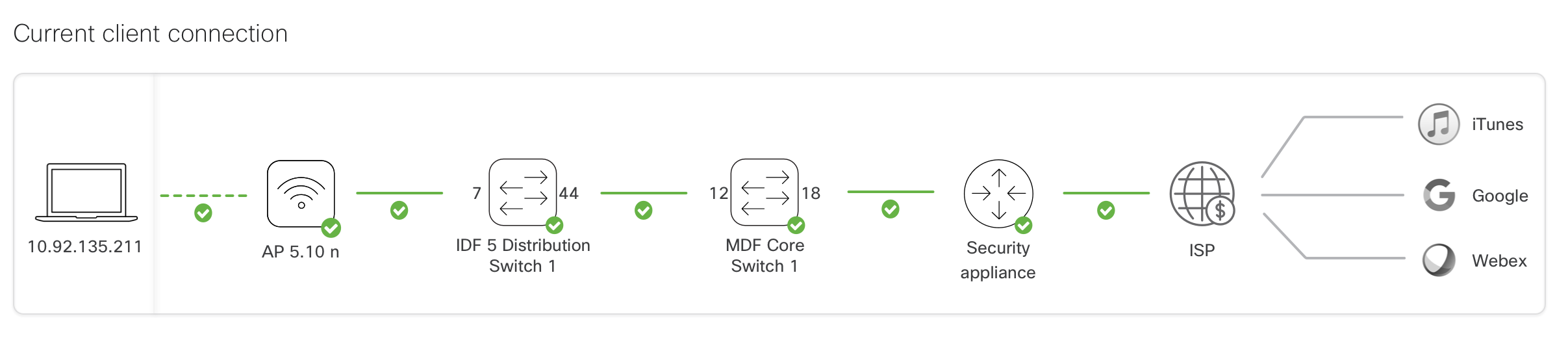
Client will not have a status because the component will live on the client page. We did not want to have redundant information or hidden information that should be clear.
Remove popover of client device and create a clear visual distinction between client and the other devices in the topology.
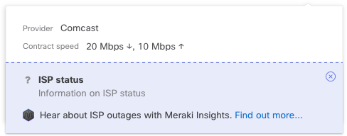
Remove popover and status from ISP and applications because most of the information is in-progress and will not be ready for the MVP release.
Visual Elements and Frontend Development
Re-usable components
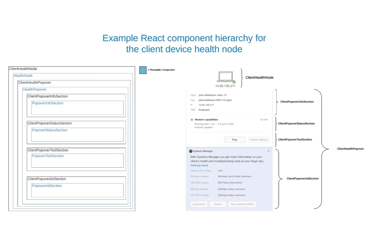
Web Ready SVGs
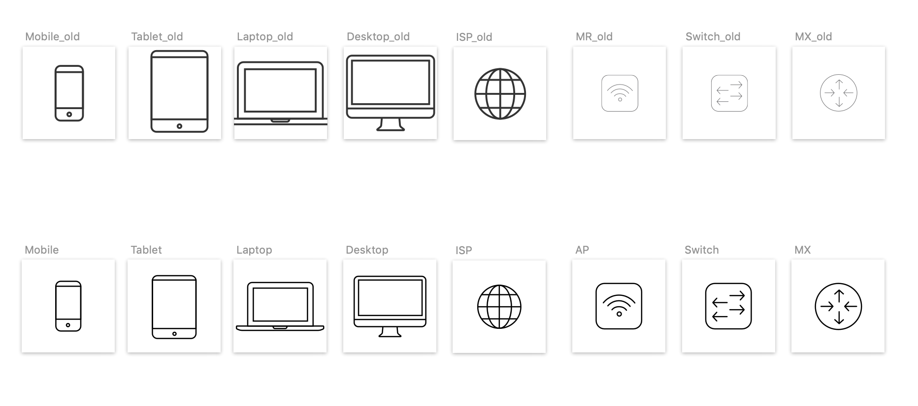
Cleaned up the icons to be of the same ratio, clean CSS, and same stroke-width+color
Documentation
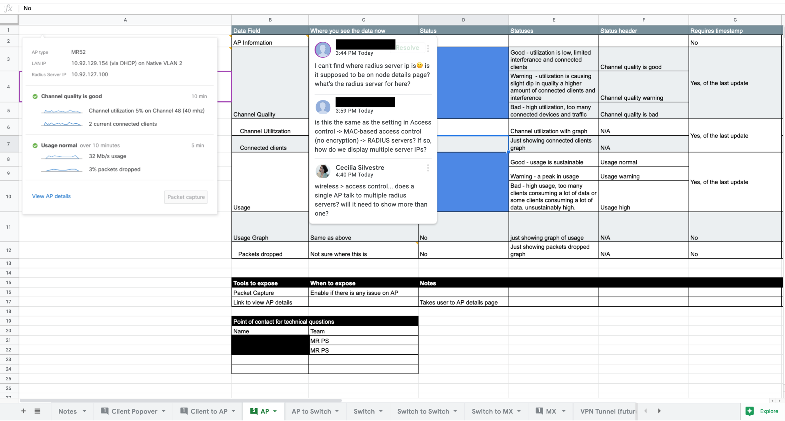
I created a shared spreadsheet to help the development team understand the different states of each popover. We used this spreadsheet to inform our conversations with product specialists; it made it easier to ask “for this status, what are the thresholds?”. The document was also shared with our API team to help inform them of what end-points will be necessary.
Summary
This project is the first in the line of cross-functional features. We understand that users see their network as a series of inter-connected devices instead of as distinct and separate devices.
Our team worked with the other product teams and each team contributed to the shared spreadsheet.
The project is live. View on Meraki.