Alation · Data Lineage · 1.5 Years
Metadata Layer Overlays featured on Alation’s website
Reimagining Data Lineage
Transforming an unusable graph visualization into a Google Maps–style exploration tool that drives adoption, compliance, and confident data decisions.
The Spaghetti Monster Problem
Alation is a leading data intelligence platform used by enterprise teams to catalog, govern, and understand their data. Data lineage—the ability to trace how data flows from source to destination through transformations—is foundational. It underpins trust, compliance, impact analysis, and operational efficiency.
When I took ownership of the lineage experience, the feature had earned an internal reputation captured by a dedicated Slack channel: #data-lineage-spaghetti-monsters. The visualization was so cluttered and slow that users avoided it entirely. For a feature meant to build confidence in data, it was doing the opposite.
This was not a cosmetic problem. Unusable lineage meant analysts couldn't validate data origins, engineers couldn't predict the blast radius of schema changes, and compliance teams had no reliable way to produce audit-ready diagrams. The business impact was tangible: slower data adoption, risk exposure, and customer escalations.
Roles & Leadership
As the lead product designer, I drove the end-to-end design strategy across a 1.5-year engagement. I partnered directly with a product manager and engineering lead, forming a tight triad that owned the lineage roadmap.
My responsibilities extended well beyond visual design. I led the experience audit, facilitated cross-functional alignment on the product vision, defined a phased delivery strategy that balanced user impact with engineering feasibility, and championed design-led thinking at the leadership level to secure sustained investment in the initiative.
Throughout the project, I conducted user research sessions with data analysts, stewards, and platform administrators to ground every design decision in real workflows and pain points.
Before: Cluttered edges and overlapping lines
Before: Spaghetti monster with limited filters, difficult navigation, and overloaded objects
After: Organized objects by data source, added filters, and metadata layer overlays to contextualize data.
Google Maps for Data
““Show me how data moves from this source to this report. Highlight everything in between, and flag any issues along the way.””
This metaphor was deliberately chosen. Just as Google Maps lets users zoom in and out, choose routes, and surface contextual information like traffic and closures, our lineage tool needed to support progressive disclosure, directional exploration, and layered context. The metaphor gave the cross-functional team a shared mental model and helped prioritize features against a clear experiential benchmark.
From Spaghetti to Strategy
Data Discovery & Validation – Trace origin, ownership, and trustworthiness of data
Impact Analysis – Predict the ripple effect of changes before they happen
Technical Debt Reduction – Spot inefficiencies and optimize view for performance
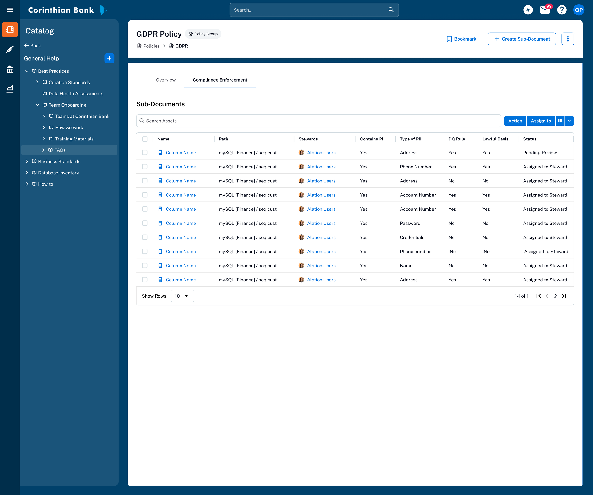
Regulatory Compliance – Generate clear, audit-ready lineage diagrams
Manual Lineage Curation – Fill gaps when automated lineage isn’t available
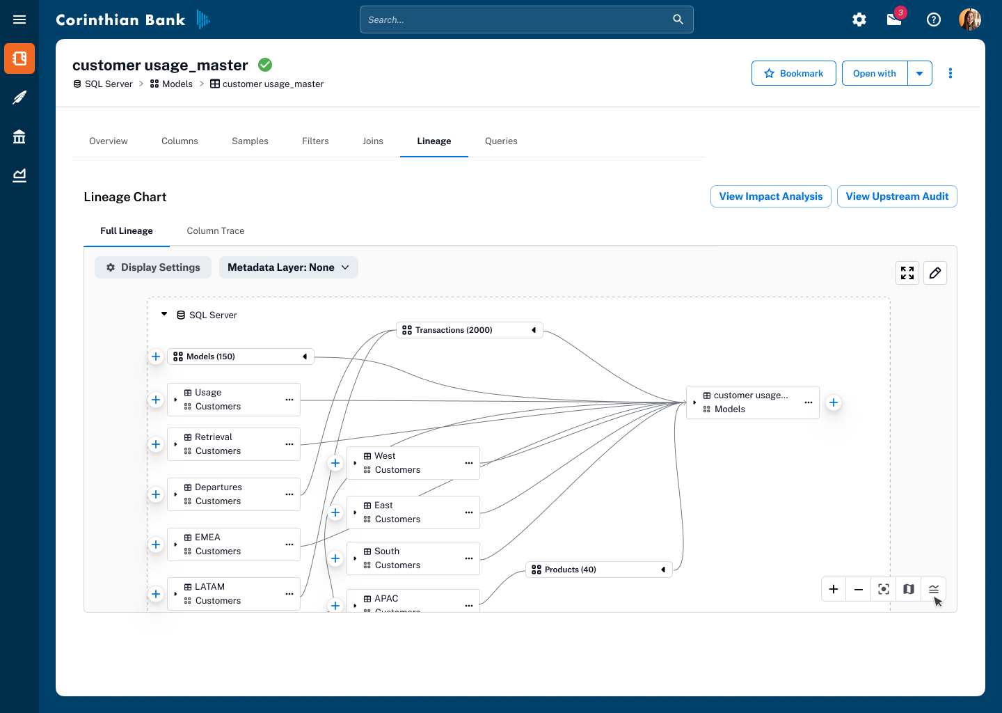
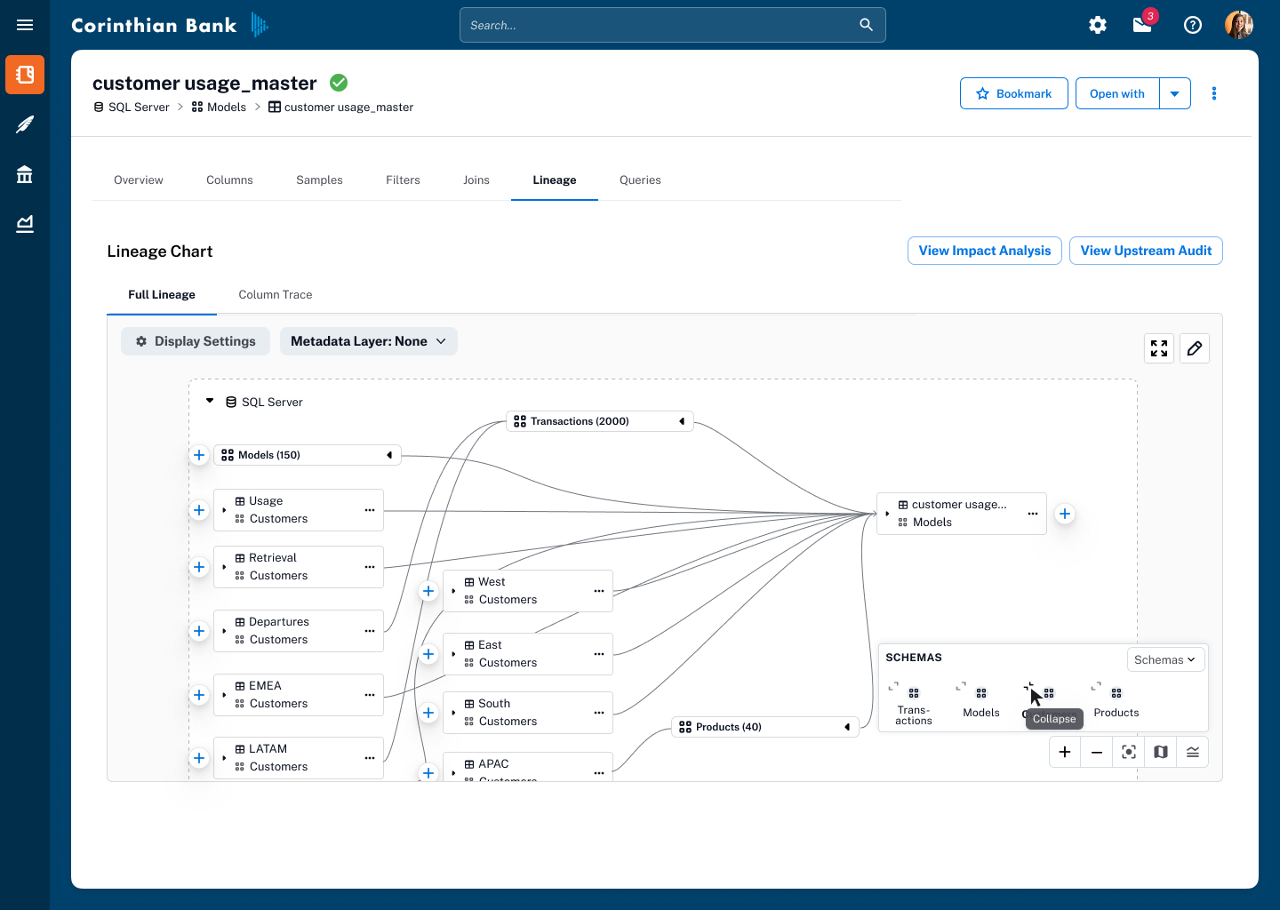
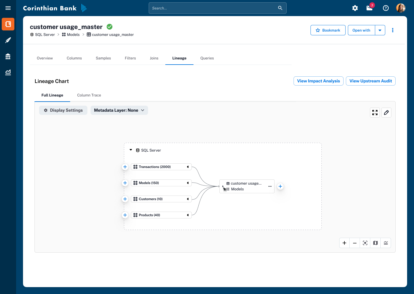
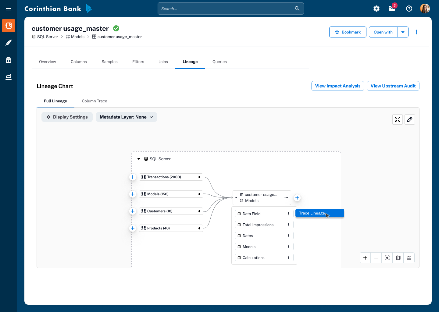
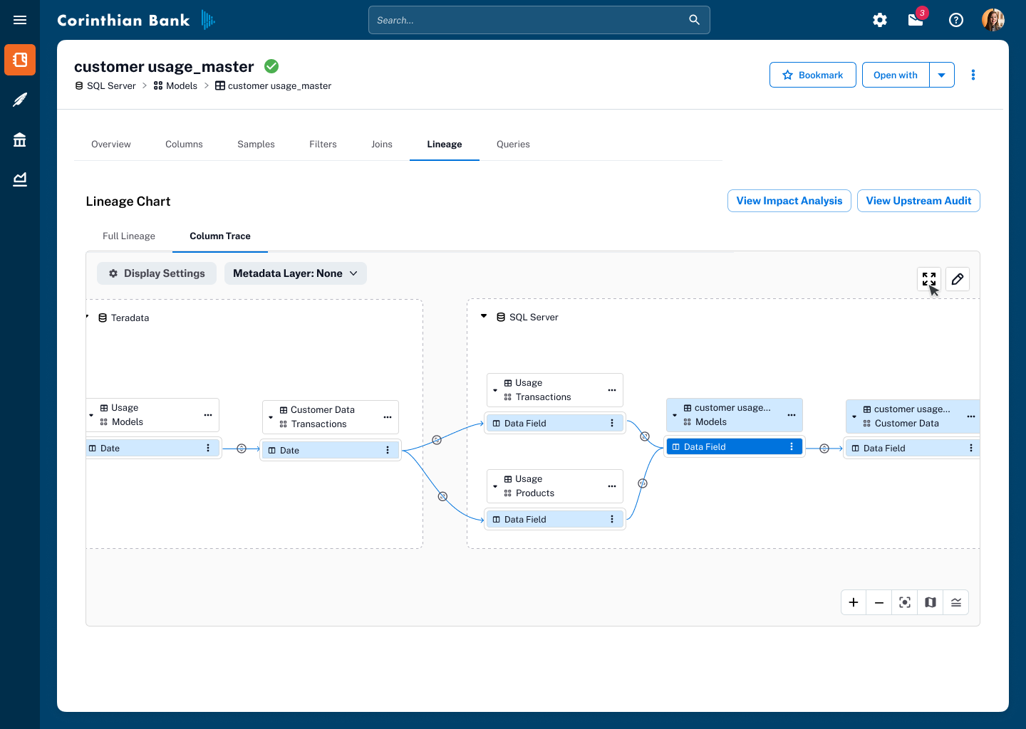
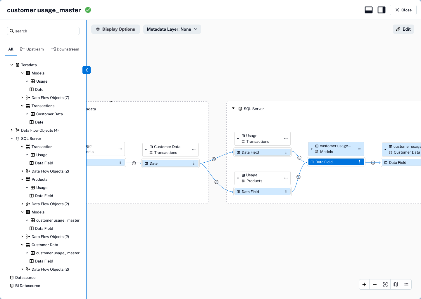
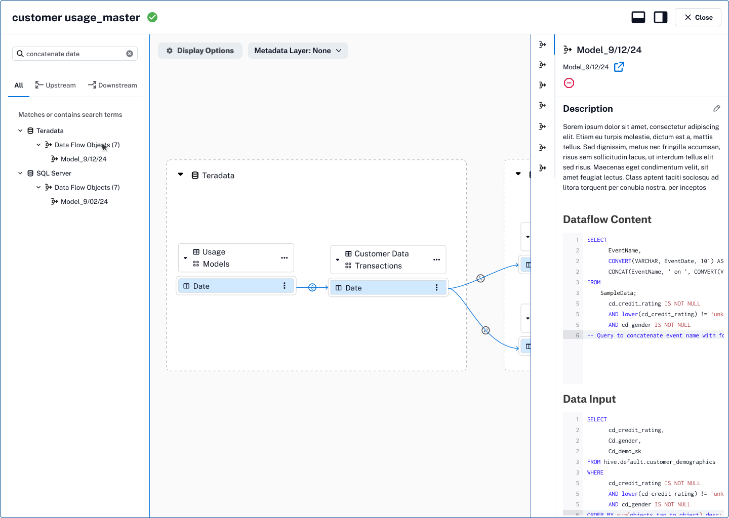
Decluttering the Graph
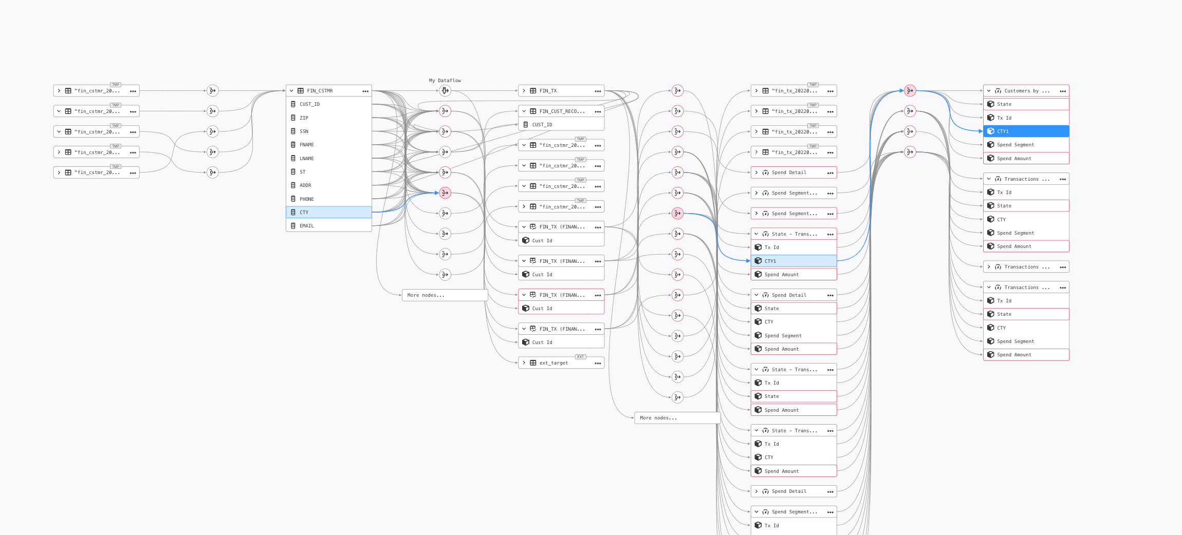
The existing graph was overrun with Data Flow Objects (DFOs)—nodes representing transformations, joins, and queries. Many were duplicates or deleted objects. The visual noise made it impossible to follow meaningful data flows.
I ran low-fidelity design experiments exploring different strategies for showing and hiding DFOs, testing prototypes directly with end users.
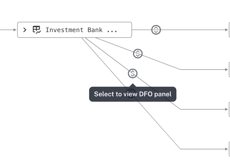
Collapsed all DFOs into a single streamlined edge with a dedicated icon indicating their presence. Users expand transformations on demand. Additionally introduced an always-visible legend and a collapsible mini-map for spatial orientation.
Dramatically reduced visual clutter, improved rendering performance, and cut onboarding time by making the graph self-explanatory.
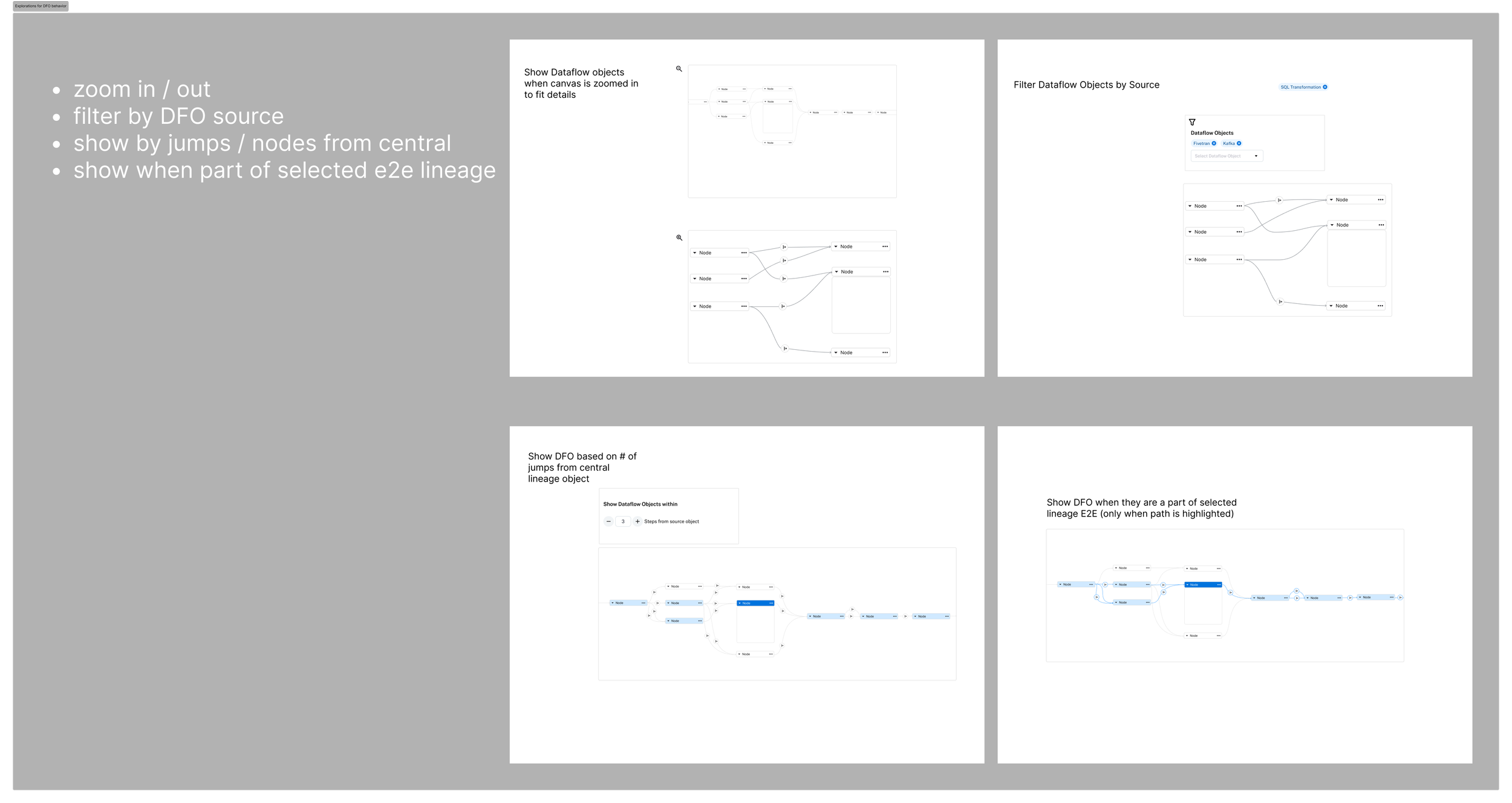
Low-fi Testing
To address this, I ran low-fidelity design experiments exploring different ways to show and hide DFOs without losing important context. I tested these prototypes directly with end users, focusing on methods that balanced clarity with quick access to detail.
Collapsible DFOs
The preferred solution was to collapse all DFOs into a single streamlined edge, using a dedicated icon to indicate their presence. Users could click the icon to expand the underlying transformations on demand, allowing them to explore deeper when needed while keeping the default view clean, focused, and scannable. This approach not only reduced clutter but also improved performance by simplifying what the viewport had to render on load.
Designs for DFO viewing
Introduced an always-available legend to help users quickly interpret object types and trust statuses at a glance, improving scanability and reducing onboarding friction.
Added a collapsible mini-map to make navigating massive lineage graphs intuitive, while giving users context of their current position in the overall data flow.
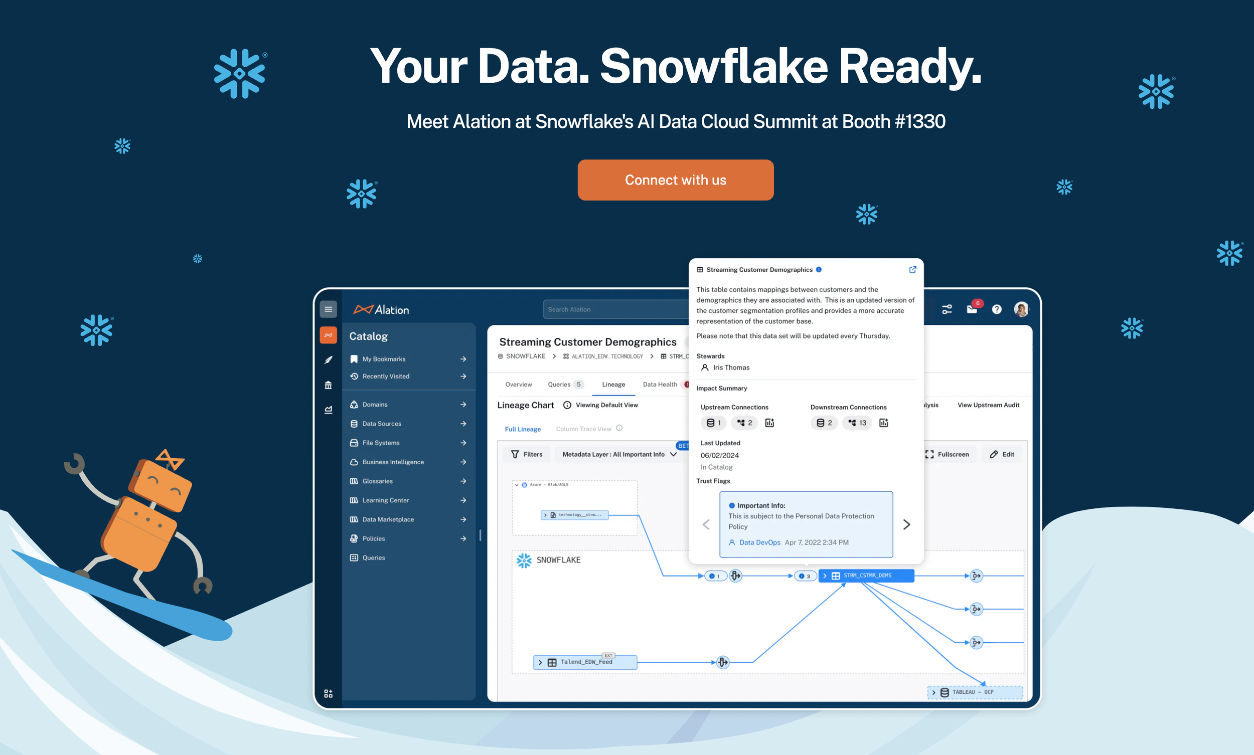
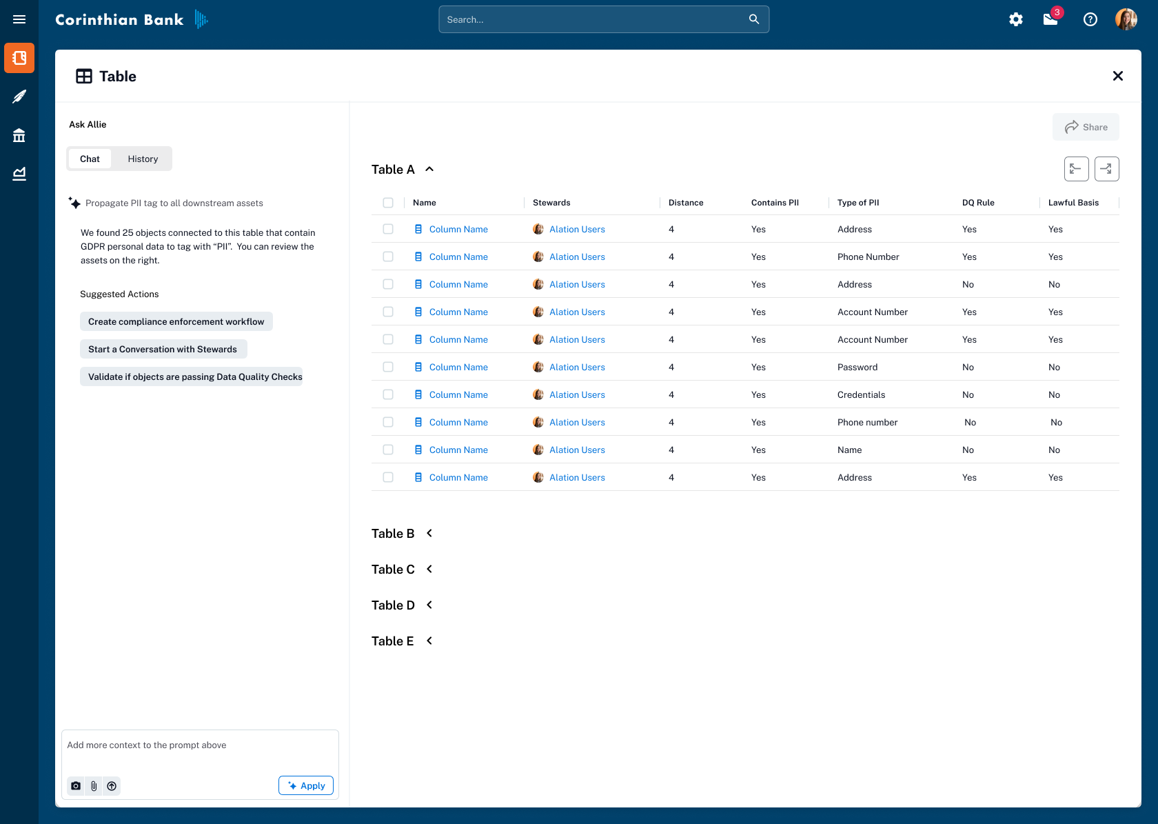
Metadata Layer Overlays
Metadata Layer Overlays
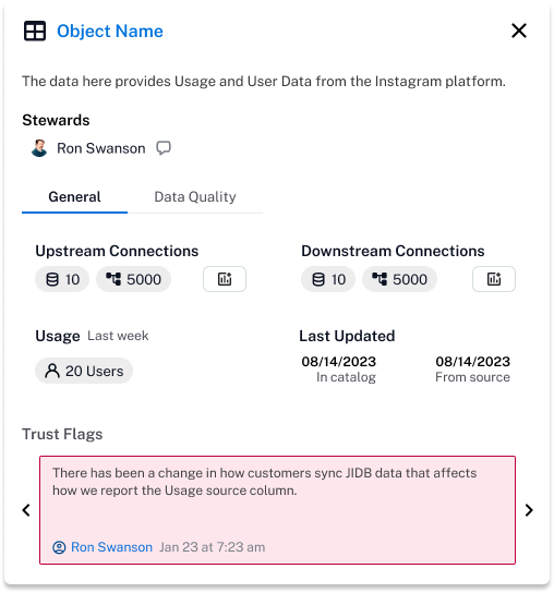
Lineage showed how data moved but not whether it could be trusted. Users had to leave the graph to check trust flags, compliance tags, or data quality—breaking their flow.
Designed a metadata overlay system surfacing trust flags (endorsed, deprecated, warning), custom fields (PII, GDPR), and data quality indicators directly on lineage nodes. Clicking any object opens a concise popover with deeper metadata.
Transformed lineage from a structural diagram into a context-rich decision-making tool. Prominently featured on Alation's website and became a key differentiator in competitive evaluations.
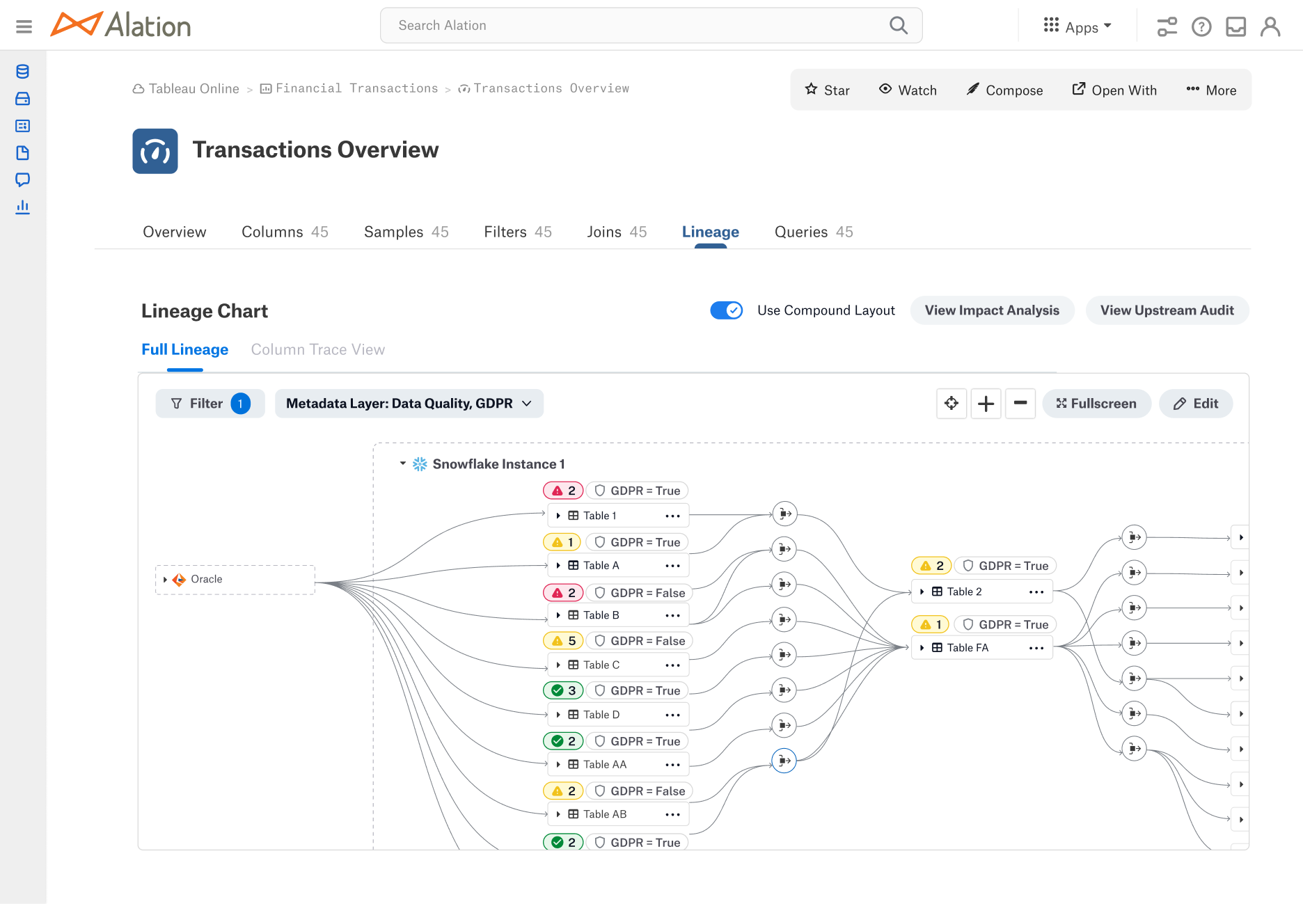
Metadata chips to show status of data quality and custom field “GDPR”
Incremental Loading
Incremental Loading
Large enterprise lineage graphs could contain thousands of nodes. Loading everything at once caused performance degradation and cognitive overload.
Designed an incremental, directional exploration model—users expand upstream or downstream step by step, following paths relevant to their task. Added a prompt offering the choice between incremental and full-load modes.
Eliminated system lag on large graphs, reduced time-to-insight, and made the experience feel fast and intentional.
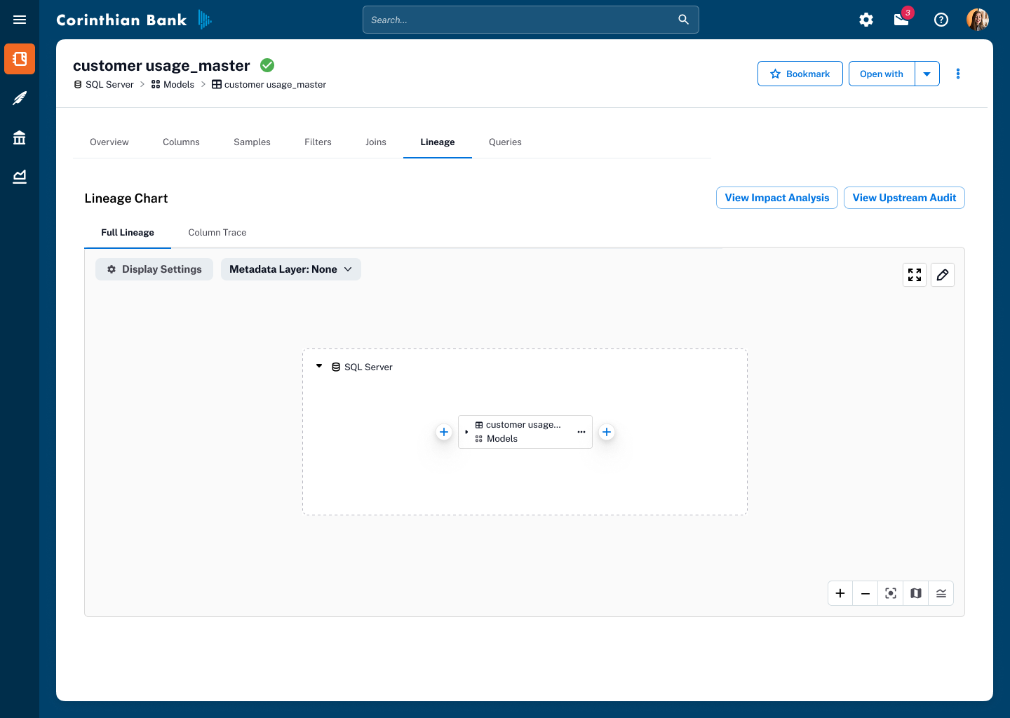
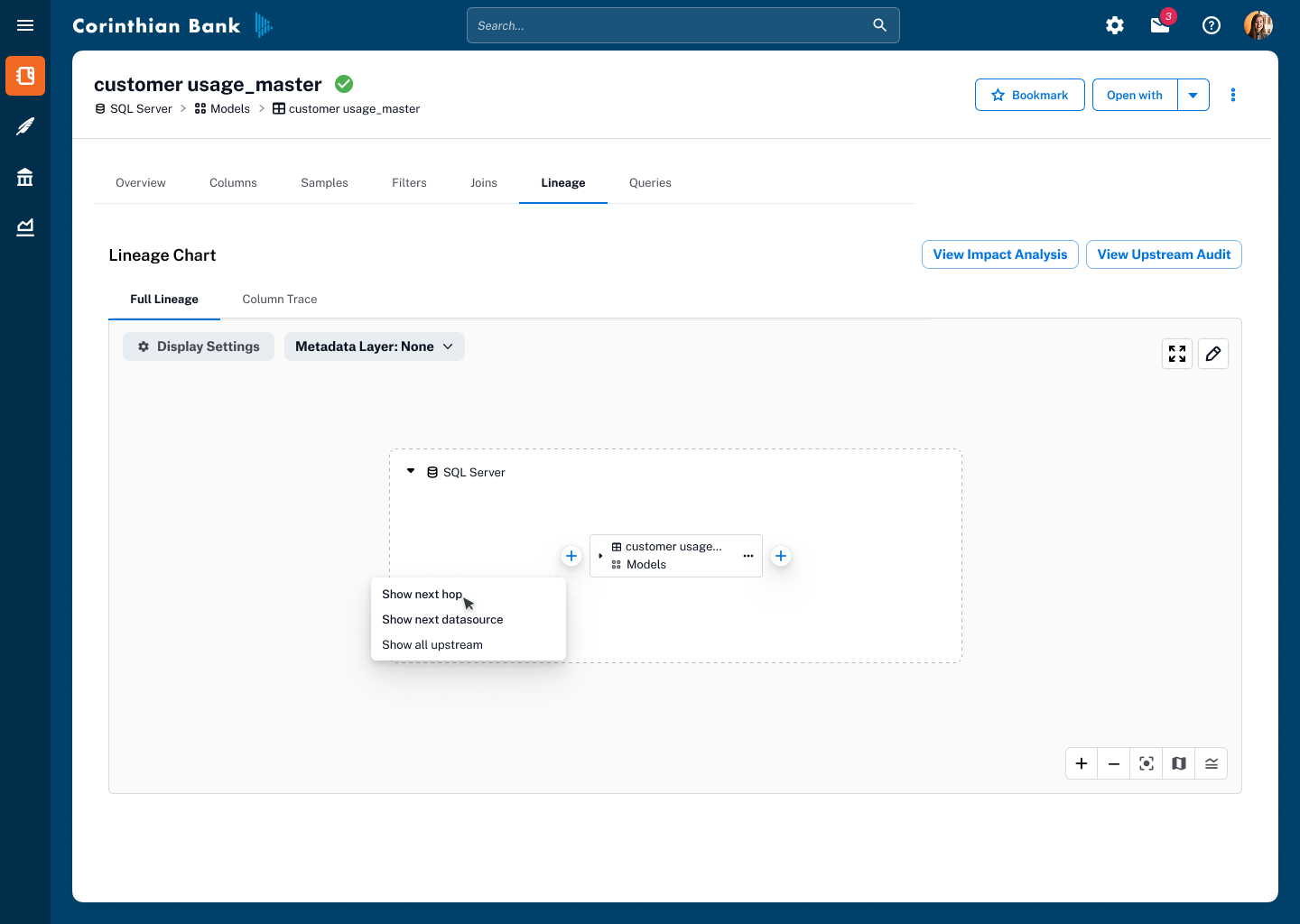

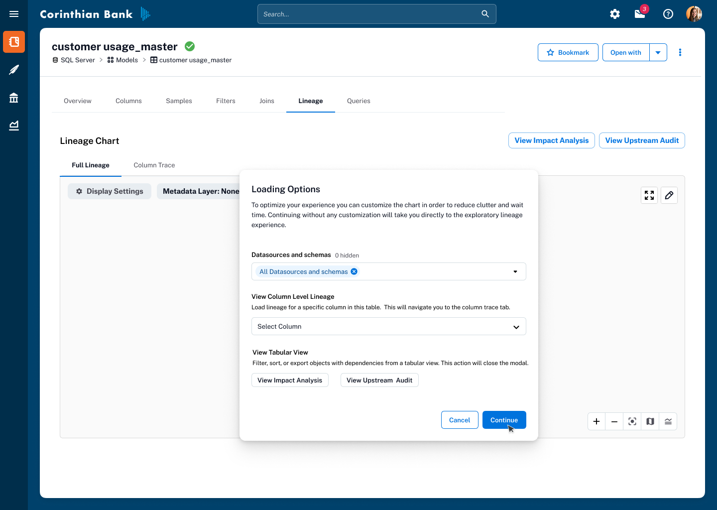
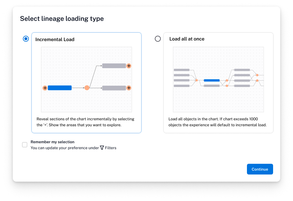
As we rolled this out to a broader audience, we added a prompt giving users the choice between incremental loading and load all at once, empowering them to tailor the experience to their workflow and system needs.
Manually Edit Lineage
Manual Lineage Curation
Automated lineage capture inevitably has gaps. Without correction tools, lineage risked becoming unreliable.
Designed an editing experience with confirmation states and visual safeguards, giving stewards and admins the ability to add, remove, or adjust connections while preventing accidental changes.
Closed the loop between automated capture and human expertise, keeping the graph trusted for compliance and data usage.
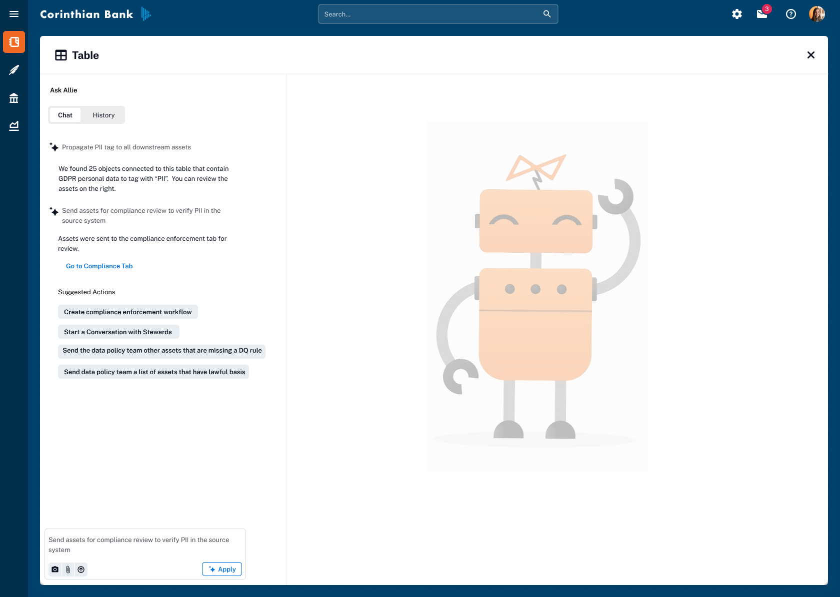
Exploring AI-powered features that leverage Lineage
AI-Powered Metadata Propagation
Prototyped "Ask Allie"—a conversational AI experience where users could instruct the AI to propagate metadata flags (e.g., PII tags) across related assets downstream. The design maintained user control through explicit confirmation steps, reducing repetitive manual tagging while ensuring accuracy.
Outcome
| Phase | What Shipped |
|---|---|
| Phase 1 | Improved graph readability, collapsible DFOs, mini-map, legend, and incremental loading—resolving the most critical usability and performance issues. |
| Phase 2 | Metadata layer overlay with trust flags, custom fields, and data quality context directly in the lineage view—featured on Alation's marketing site. |
| Manual Edit | Empowered subject-matter experts to maintain graph accuracy for compliance and governance workflows. |
| AI Prototype | Informed Alation's forward-looking AI strategy for intelligent automation within governance. |
What I carried Forward
Vision anchors execution.
The "Google Maps" metaphor wasn't just a pitch—it was a decision-making framework that kept the team aligned across 18 months of incremental delivery.
Ship incrementally, think holistically.
Each phase stood on its own, but every decision was made in service of the long-term exploratory model.
Co-design with engineering.
The best solutions emerged when design and engineering shared ownership of the problem space.
Let users validate the hard calls.
Prototyping multiple approaches and letting users choose prevented us from optimizing for the wrong heuristic.